
I must admit to some rubber-necking. It proved impossible to walk into a gallery building without peeking into *gasp* unlisted spaces. Whether reacting to works included in the thirteen targeted shows or the incidental pop-ins, one question kept cropping up: What's with all the "lazy" art? Many, if not most, of the paintings I viewed included self-consciously crude mark-making and muddy washes. Much of the sculpture appeared physically weak and haphazardly fashioned, in some cases already showing signs of damage. The videos were rough-hewn collages, not markedly distinct from the toss-off Flash sketches precocious teens make and upload onto YouTube. Have we reached a point where artists feel the need to highlight their existential doubt by sabotaging their technique, or is this instead indicative of a real decline in craft and an increase in carelessness? Are young artists responding to fleeting celebrity and the culture of expected obsolescence by making work that appears temporal or even disposable, or are they just more humble than their predecessors? The reasons are surely many, but whatever the justification, a lot of what I saw looked plain shoddy.
At the other end of spectrum are those young artists who have embraced technique, but have few, if any, good ideas. Though not as common as their slacker counterparts, they show in good number. Chad Marshall's show of large oil paintings at Priska C. Juschka Fine Art is representative of this group. To some extent, I admire Marshall's painting, but his grotesque, angst-ridden figures (presented on backgrounds of flat color, no less) remind me of the sort of thoughtless, fashion advertisement inspired figure painting so many of us produced when we were starting undergrad. This critique is harsh - perhaps too much so - but my vitriol is the product of my feeling the artist capable of much better work. There is promise in these works, particularly in Marshall's attractive works on paper.
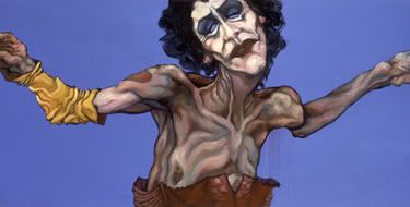
Chad Marshall
"Painting #6"
2002
Oil and flashe on MDF
24 x 48 inches
Marshall's was one of the few solo efforts I saw visited on Wednesday. Summer, after all, is the season of the group show. With one or two exceptions, I wasn't impressed with the curatorial thrust of the shows I visited and I've been skeptical of most every show description I've see online or in print. This is not to suggest that the included artwork is poor, only that the themes and groupings seem consistently arbitrary, if not patently absurd and unnecessary.
Case in point: "Tabletop," the exhibition on display at Josee Bienvenu Gallery. All works in the show, some of which are very nice, are placed on low tables, under glass. The press release justifies the unusual presentation in two ways. Firstly, we should all take a load off. "The world deserves a break. A table and chair help resist the summer heat in Chelsea...an invitation to slow down and take a seat." Fair enough, I suppose, but I'm not sold. Secondly, the table top approach allows viewers to experience the artwork as the creators do. "...a show of horizontal drawings, the negation of the tablecloth. Passing from table to table, one experiences the intimate relationship between the paper and the artist as the works are seen from the perspective they were made at." OK, even if this is true for the majority of the included artists - many produced work specifically for "Tabletop" - why display the work in this way? It does nothing to enhance the drawings and paintings. Why not present the same group of artists without the "clever" twist? As is, I feel like a Hollywood producer hearing a gimmicky pitch. It stinks. Let the pictures do the talking, not some half-baked curatorial umbrella.
Over at Galeria Ramis Barquet, the curators dubbed their ill-considered effort "Better Than Sex, Better Than Disneyland." Explaining their choice of title, the press release reads, "The wide gamma of works in [the exhibition] recreate the pleasure that the artists attain from completing a simple musical or drawing exercise, and therefore elicit an immediate response from the viewer." What's with the psycho-sexual silliness? Doesn't
all artwork "elicit an immediate response from the viewer," even if it's only a bored shrug?
Although I thought little of the exhibition overall, I was drawn to the watercolors of Alejandra Alarcon, a Bolivian born artist living in Mexico City. Her work - sexualized, bloody riffs on the "Little Red Riding Hood" story - fit the show's theme better than that of her counterparts. Two pieces were particularly captivating. I would have liked to include images of "Caperucita con abrigo de piel, sangre y barriga" ("Little Red Riding Hood with fur coat, blood and belly") and
"Capa con colas de lobo," ("Cape with wolf tails") but, unfortunately, I could not locate these works online.
+++++
Sara Meltzer: With discouraging daily news from the Middle East and unusual, monsoon-like conditions affecting the tri-state area, I find myself using two of my father's favorite words, bleak and melancholy, more frequently as of late. Standing outside a bar on Tuesday night, three sheets to the wind, a friend demanded to know why educated Americans aren't up in arms, actively engaging policy and community. A passerby heard her
query and responded, lifting his arms above his head as he laughed, "See. I am up in arms. I'm up in arms!" My friend looked back at me, exasperated. "Seriously. Why aren't we?"
The press release for "Prevailing Climate," the summer group show at Sara Meltzer Gallery, tells visitors that the show "examines the tragedy, fear and distrust that connects our history, politics, consumerism and mass media." For the most part, curators Rachel Gugelberger and Jeffrey Walkowiak succeed, although the exhibition provokes in me the same resigned, baffled shrug my friend's drunken question did. It's too easy to attribute western apathy to the decline of the American Empire - although the liberal rhetoricians' parallels between the United States and Rome are apt - and it's undeniably selfish to ignore the troubling circumstances altogether. Most of us toil away somewhere in the middle, muttering about the bleak outlook, riding bikes in symbolic protest, writing letters to politicians, but generally feeling as though things are out of our hands. Why get up in arms if there is nothing to lift, or if the opposition is a phantom?
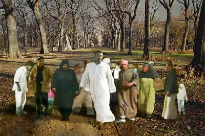
"Blowback"
2005
DVD
Running time: 4:30 minutes
Edition 1 of 5
An answer of sorts can be found in Karina Aguilera Skvirsky's video, "Blowback." Although the piece can be filed under the Flash collage aesthetic I grumble about above, Skvirsky manages to do a lot with very little. The hypnotic video is four and a half minutes long, but it seems much shorter (always a good sign). On screen, figures appear in brief, clipped loops, taking a few steps toward you before jerking back to what appears to be their original position. Almost
imperceptibly, though, these figures approach, in a cut-and-paste version of "for every three steps forward, two steps back." As the figures near, the landscape grows darker and more menacing, an effect complimented by the accompanying music. Eventually, the background is blocked from view by the now pixelated, fractured figures. They are upon us. The soundtrack bangs and grates. We've been consumed, assimilated, obliterated. To black. The video starts over...and again, I'm hypnotized.
"Blowback" serves as a wake-up call of sorts, a plea for all to participate rather than merely observe. If we do nothing - if we just watch the machinations from our couches - we will all fall victim to the darkening tide. As Thomas Jefferson famously said, "Eternal vigilance is the price of freedom." And apathy is a form of bondage.
I later searched for "Blowback" on YouTube. Unfortunately, I couldn't find it. I wish more video artists would take advantage of the incredible distribution resource presented by the web. The DVD of "Blowback" may or may not sell to some wealthy collector who can gamble on an investment, but what of the thousands of media hungry minds clicking through YouTube every day? Why not turn video art into viral video?
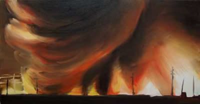
"Plume 2 (Strange Weather series)"
2005
Oil on canvas
26 x 46 inches
The rest of "Prevailing Climate" is relatively strong. Works by Joan Linder, Joy Garnett, Jason Middlebrook and Anna von Mertens standout. Attractive - indeed, almost decorative - the two oil paintings included by Garnett are deceptive. Her subject matter, garnered from online news media, is associated with warfare, be it images of prisoners, war machines, military officers or torn landscapes. The two pieces included in "Prevailing Climate" belong to this last group. Calling to mind work by the Romantic painters, Turner and Friedrich, Garnett's burning, red-and-orange vistas are as disturbing as they are beautiful. In this sense, they are sublime, in the traditional sense, inspiring awe and a little fear. Looking at the work, particularly the smaller of the two, "Plume 2 (Strange Weather Series)," I find myself wondering what effect the super abundance of such images in our media has on our moral response. Have we, as a society, learned to cope by abstracting these violent, troubling scenes, ignoring the documented wrongs by treating them as we do a friend's postcard from abroad?
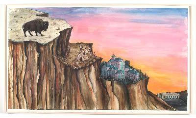
"How the West Was Won"
2004
mixed media on paper
46 X 80 inches
Jason Middlebrook's painting, "How the West Was Won," is sprawling, raw and ambitious, if a little obvious. The gradual descent in elevation, from the bison pictured on the tall plateau to the convenience store in the lower-right of the painting, needs no explanation, but Middlebrook's strong sense of color carries the painting. Although I liked the piece, I feel much of Middlebrook's work is superior.
+++++
Morgan Lehman: "Flight Plan" initially feels of a piece - due to the thoughtful presentation, the viewer flows comfortably from work to work in this attractive gallery space - but the exhibition never takes off as a cohesive whole. Happily, there are enough individual successes to satisfy. The wording of the press release suggests participating artists supplied the gallery with work specifically produced for the show: "Each artist brings his/her own interpretation to the show's name sake, with some literally addressing the concept of flight, while others explore the metaphoric possibilities of the subject." Jeffrey Milstein is representative of the literal camp; he contributes four handsome, straightforward photographs of airplanes seen from below. Two pleasing ink and watercolor works by painter Franklin Evans, on the other hand, are only loosely connected to the exhibition's theme. To make pegs fit, I'll call these colorful, abstract works "flights of fancy." They suggest a process comprised of sequential reactions to what came before; constructed in this episodic manner, they are a painter's picaresque.
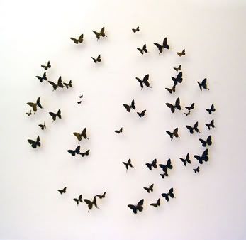
Paul Villinski
"Departure"
2006
Found aluminum, wire, lead, soot
48 inch diameter, 52 elements, Variable edition of 3
I was most intrigued by the work of Amy Ross and Paul Villinski. Both artists include pieces that border on the precious. Villinski's "Departure," a circular grouping of 52 delicate, wall-mounted butterflies, risks being dismissed as a one-note, kitsch celebration of reincarnation or transformation. But spend a few moments with the piece and you just might find yourself asking what's wrong with a little peace, love and understanding. Villinski cuts butterflies of different shapes and sizes out of flattened, aluminum beer cans and paints these recyclable insects in an uneven black wash. A close look reveals that Villinski's favored brands - or at least the cans he collects most often - are Coors Light and Tecate. I'm only too happy to see these watered-down beers turned into art that shamelessly embraces simple, beautiful gestures.
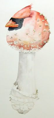
Amy Ross
"Birdshroom #22"
2006
Watercolor on paper
20 x 17 inches
Amy Ross creates delicate watercolors of hybrid bird-mushrooms, all of which come precariously close to cute irrelevance. In fact, upon first consideration, I responded negatively, categorizing Ross as an artist who wants to produce naturalistic images, but feels compelled to morph and tweak her subjects just enough to be considered distinct from - and presumably superior to - traditional natural history illustration. Who knows? This might be the case...but I doubt it. Admiring "Amanita Tanager #2" and "Stropharia verdin," the strongest of the pieces, I accepted the work at face value; these are well-crafted, lovely renderings of species one might discover in Wonderland. They aren't the most inspired paintings I saw on Wednesday, but they possess a sincere integrity largely absent in the work of young, contemporary artists.
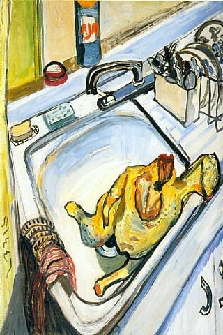
Note: Despite the help of Morgan Lehman staff and some determined Internet trawling, I can't supply an image of either of the two Ross paintings mentioned above. Instead, I've pictured another of the works on display in "Flight Plan."
+++++
RARE: I'm not sure how I feel about galleries including the curator's name in the exhibition title. "Diamonds Cut Diamonds: Curated by Johnston Foster," the group sculpture show at RARE, is the first example I've come across, and I'm tempted to call the choice arrogant, but questions about the nature of the curator's role generate a lot of ink these days - artist or academic; guiding light or cataloger - and, to some extent, it seems
sensible to marquee the name. (What's more, Foster is a working artist who exhibits at RARE. The gallery may just be taking advantage of an opportunity to further promote one of it's own.)
Foster has assembled a group of five emerging sculptors who all use "mundane materials." Kate Horne's animated horse heads, fashioned out of paper grocery bags and other miscellany, are whimsical enough, but fleeting, and Morgan Herrin's "untitled (Reclining Woman)," carved out of polystyrene and foam, has me fretting about Herrin's use of a respirator when I should be considering the art. More successful are Ryan Kitson's witty works - his "Tusk
Sculpture" is at once lovely and biting - and Dave Choi's clusterfuck creations.
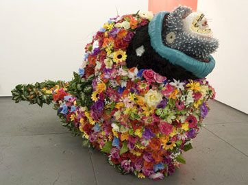
Dave Choi
"Jumbo"
2006
Plexiglas, epoxy, hot glue, foam, mixed media
56 x 88 x 32 inches
I want to like Choi's work more than I do. Exuberant, grotesque and shockingly colorful, his sculptures will please most any fan of Industrial Plastics (the mecca of kitsch, on Canal Street, in NYC) but their synthetic makeup can be a bit distracting. "Jumbo," the best of the bunch, is a celebration of pulsing life, at once calling to mind Jonah and the whale, Russian dolls, leeches, Ridley Scott's Alien, and a number of other associations, but the shiny, dead materials betray the organic feel of the beast. This is stilled life; I'm left cold. Still, Choi could do terrific things. He's close already.
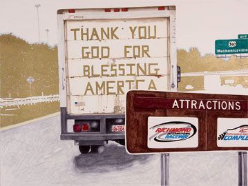
Jeff Lutonsky
"Nowhere Road (Ramblin' Fever)"
2006
Magic marker and pencil on paper
30 x 40 inches
In the back room of RARE, painter Jeff Lutonsky presents "Ain't Livin' Long Like This," a group of magic marker and pencil drawings celebrating the sub-cultures of NASCAR and the rodeo. All well and good - "Business and Pleasure" and "Slippers" are both nicely worked drawings - but I'm thrown by the press release. "Confronting the strict stereotypes attached to the 'red neck' ideal, the viewer ultimately finds beauty and peace in the toughness of rural living." Um, this ain't necessarily rural living and it certainly ain't "tough." Having grown up in a Virginian town of ninety-nine people, I'm familiar with the culture of rural areas, and the iconographic images Lutonsky offers are more closely associated with southern suburban sprawl. The most representative work, and the best of the bunch, is
"Nowhere Road (Ramblin' Fever)," but this road isn't nowhere. The road sign gives away the location as a particularly ugly stretch of I-64's loop around Richmond, Virginia, an area I associate more with WalMarts and strip malls than hardscrabble, rural life.
+++++
Yancey Richardson Gallery: One gets the sense that the folks behind "Arcadia" wanted to present a very general survey of nature-themed artwork, but felt compelled to provide a more specific focus. Thus, they describe the exhibition as one in which "artists present the relationship between nature and man as either idyllic, threatening or diminished." This is open-ended, to say the least; they might as well write "good, bad or
ambivalent," which pretty much covers all the bases and brings us back to square one. Whatever my rather petty faults with the gallery's word choice, I had high hopes for the exhibition. Sadly, the show is something of a dud overall, not because the included work is bad, per se, but because it is too similar. Ten minutes after having left the space, I had forgotten most of what I'd seen.
David Spero and Joel Sternfeld, both photographers I respect, include works that are lost among the many pleasant landscapes on display. One could argue that this betrays a failing of their pictures, but in this instance I feel it says more about a group exhibition that drowns in sameness. Anthony Goicolea, whose attractive drawings and paintings are captivating, here includes a boys-back-to-nature photograph that is imminently forgettable and
rather obvious (in case there is any doubt, the press release name drops Lord of the Flies).

Clare Richardson
"Sylvan, Untitled XX"
2002
Chromogenic print, Edition of 9
24 x 30 inches
Clare Richardson's photograph, "Slyvan," is used on the show's promotional material. A young field worker is pictured from the back, pitchfork slung over his shoulder, as he contemplates a rolling, bucolic European landscape. Looking at the picture, I feel a reactionary longing, a la Thoreau. Ah, the simpler life - hard, manual labor, good sleep and few questions - and a sustainable relationship with land, flora and fauna: is this not better than today's destructive, anxiety-ridden capitalist mess? This is Romanticism at it's most effective and, as such, it borders on propaganda. Perhaps this is why I couldn't imagine living with the print; it celebrates an uncomplicated, beautiful lie.
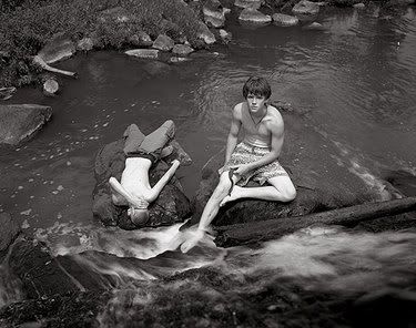
Jeff Whetstone
"Two Boys and Water Snake"
Gelatin silver print, Edition of 5
24 x 30 inches
The strongest piece in "Arcadia" is Jeff Whetstone's "Two Boys and Water Snake." Straight-forward and unremarkable, the picture features two shirtless boys, brothers possibly, in swim trunks, resting on river stones. A water snake is gently grasped in hands of the older boy. The boy gazes up at the camera carelessly; the snake flexes it's mid-section as it moves toward freedom. The photograph succeeds where Richardson's does not, precisely because it acknowledges Nature's indifference. The snake's will to live is little different from that of his captor. We are all brutes, transcendence and intellect be damned. Where Golding's Lord of the Flies seeks to remind readers of this existential truth, "Two Boys and Water Snake" subtly documents it.
+++++
Cheim and Reid: "Soutine and Modern Art" presents gallery visitors with what must be the most impressive non-museum lineup in New York. Every participating artist, whether dead or alive, is of all-star caliber: de Kooning, Pollock, Dubuffet, Guston, Freud, Auerbach, Baselitz, Mitchell, Diebenkorn, Bourgeois and more. Many of these heavy-hitters have only one work included in the exhibition; Soutine, however, has around fifteen paintings hanging. Now, I really like Soutine, but I
was still surprised by my relative disinterest in the other work at Cheim and Reid. I spent a minute with the Pollock, the Dubuffet and the Guston, but even these paintings seemed dull, self-conscious and labored alongside the best of the works by Soutine. Only two works, Alice Neel's "Thanksgiving" and a large painting by Susan Rothenberg (annoyingly, I've forgotten the title), provoked in me anything resembling the pleasure derived from the their Jewish, Franco-Russian elder.
Alice Neel
"Thanksgiving"
1965
Oil on canvas
30 x 34 inches
Soutine is among the finest examples of a painter's painter. That is to say, he uses oil paint in a visceral manner, pushing and spreading it around the canvas with the intensity of El Greco or Rembrandt. There is as much excitement in his paintings' surfaces as there is in the caricatured movement and contours he depicts. My favorite work in the show, "The Rabbit" pictures a dead animal, hung by the rear legs and awaiting butchering. Soutine strips the composition down and yet I
spend five minutes with the painting, stepping in close, scanning from top to bottom, bottom to top, and then stepping away again. It's rare that I have such a physical interaction with so small a painting. Rare and very, very cool.
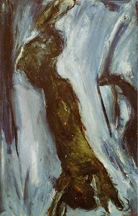
Chaim Soutine
"Rabbit"
Circa 1925
Oil on canvas
30 x 18 1/2 inches
There are other brilliant works at Cheim and Read. Also making my shortlist: "Landscape at Ceret," "Rabbit with Forks," and "Great Pheasant." I coveted all of these, the only sure sign that I'm in the presence of an artwork I truly love.
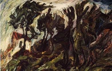
Chaim Soutine
"Landscape at Ceret"
1922
Oil on canvas
28 x 41 inches
Finally, "Carcass of Beef" deserves a mention. Looking at it, I remembered a funny, possibly apocryphal story I'd heard about Soutine. Apparently, he actually suspended a cow carcass in his studio and, as he continued to work on the painting, it began to stink, causing the neighbors to confront the painter in protest. After listening to their complaints, Soutine explained that art is more important than health or cleanliness, and that he had no choice but to keep the carcass until the painting was finished. Apparently, several slightly different versions of this tale are passed around - the one on Wikipedia has the police involved - but I'd like to think it's based on real events, and that Soutine was as committed to his painting as he was responsible to his medium.
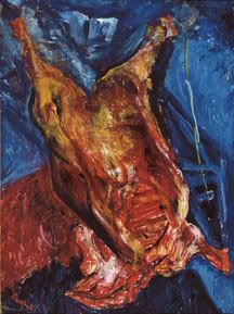
Chaim Soutine
"Carcass of Beef"
Circa 1925
Oil on canvas
55-1/4 x 42-3/8 inches
Photo credits: Chad Marshall image ripped from Priska C. Juschka Fine Art; Paul Villinski and Amy Ross images courtesy Morgan Lehman Gallery; Karina Aguilera Skvirsky, Joy Garnett and Jason Middlebrook images courtesy Sarah Meltzer Gallery; Dave Choi and Jeff Lutonsky images ripped from RARE Gallery site; Clare Richardson and Jeff Whetstone images ripped from Yancey Richardson site; all Soutine images ripped from artunframed.com; Neel image ripped from artnet.com
5 comments:
I'm amused to see so much Richmond in the mix. Kate Horne's etchings are quite good.
As for the lazy art, I think that you have left out one possible explanation. One can strike a pose of mild contempt as a defensive measure. Just look at any sullen teen. If one's efforts are rejected, one can easily say 'of course it sucked, I made it to suck'. In the event that one's efforts are applauded, one can play the irony card (with the option of claiming that this too is simply a ruse if/when the applause sours). I think it's lame and immature.
Alternately, these artists might simply be lazy and lucky enough to be around at a time when laziness is rewarded.
Whatever the case may be, I look forward to the ebb of that trend.
Actually, on further investigation, all but one of the RARE artists are connected to Richmond. I wonder who the other guy is... do they talk to him at parties or is he the token other guy? I s'pose if he wasn't in there they'd have to call it 'Richmond: Curated by Johnston Foster"
payforbuzz.com
Product placement in blogs!
Generate buzz for your product!
Hello Hungry Hyaena, thank you for your favourable comments of my work, my name is Alejandra Alarcón and I am sending you with pleasure the work concerned. Please feel free to contact me anytime for any additional information you might wish to obtain.
Kind regards, Alejandra
Some artists seem to give more, in my opinion of course, I love the Chaim Soutine "Landscape at Ceret" this is excellent, but what of Iman Maleki or Jacek Yerka two excellent artists
Post a Comment