Step #1:"It appears likely that there are about ten times as many artists in the U.S. today as there were in 1950 while the population of the country as a whole has only doubled. Are Americans five times as talented as they were in 1950? Or does this increase in quantity merely reflect demand, and correspond to a dilution in quality?"
-Piri Halasz, The New York Art World (July/August 2005)
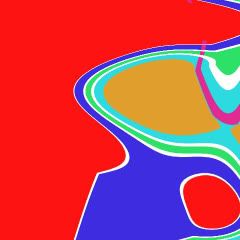
Open Adobe Photoshop and create a new file. (My example below is 120 dpi; 4 x 4 inches.) Insert a few randomly chosen blocks of color. It doesn't matter how you place these blocks or the colors that you choose. You can even use a brightly colored photograph or, better yet, an anime still.

Step #2:
Using the Wave command (found under the Filter/Distort drop-down menu), make the following selections:
Type: Sine
Generators: 6
Wavelength: 230 - 575
Amplitude: 220 - 490
Horiz: 70%
Vert: 30%
Click "OK."
The results will look something like this:

Step #3:
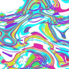
Again use the Wave command, but play with the setting as you see fit this time. Don't be afraid to use the "Randomize" button to preview possible results.

Step #4:
Repeat Step #3 until you are satisfied with what you see on the screen. If you want to add the illusion of depth, you might create more layers, but remember to be careless about any and all editing you do. Just point-and-click until something strikes your fancy.
Before you know it, you will have produced a study for a Shirley Kaneda painting.

Step #5:
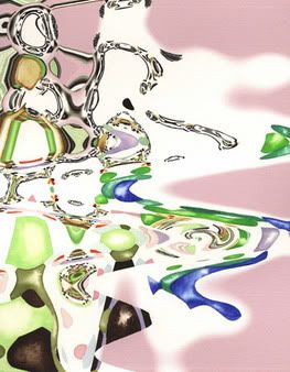
Congratulate yourself and then compare your mini masterpiece to an original Shirley Kaneda (see below).

"Untitled #5"
2003
Mixed media on watercolor paper
16 x 12 inches
Granted, Kaneda's watercolor is more subtly colored and dynamic than my toss-off exercise, but you get the idea. A painting by Shirley Kaneda is, for the most part, produced by using one Photoshop filter repeatedly!
I'm not pulling back any curtains in this post. In her recent artist statements, Kaneda makes clear her indebtedness to Photoshop. She asserts that her work "investigates the relationships between the 'photographic' and the painted or between the unique and the reproducible, as well as how new technologies might be employed to supplement traditional form."
I'm no proponent of modernism, with it's misplaced faith in forward progress, the original or the new, but Kaneda's statement would suggest that her questions are more successfully limned by James Rosenquist and Marcel Duchamp, among many others. By all means, take an existing concept/genre and mine it again, in your own fashion, but please do so thoughtfully. Making a boring, if colorful "drawing" in Photoshop and painting directly from the print? That's a shallow excavation, Ms. Kaneda, and I can't help but think you're capable of better.
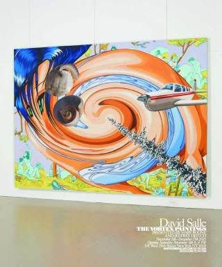
Lest readers think I'm being a cranky doctrinaire, slavishly championing handicraft over content and aesthetic delight, I should explain myself. I wince when I spot obvious Photoshop techniques used in contemporary painting because I have relied on some of the same tricks in the past. In graduate school, I produced a number of abstract watercolors and digital prints using exactly the same process Kaneda does. I also created many studies - and a few paintings - that resemble David Salle's new "vortex" series (see image below).

So what's up with established artists turning to Photoshop to generate bad paintings? Young, searching artists commonly experiment with digital filters but they usually outgrow these tools. The filters themselves are created by a team of talented designers, engineers and programmers deserving of kudos, but when abused by painters, the same filters become crutches.
Photo credit: Hungry Hyaena, Feigen Contemporary, Hustler of Culture

7 comments:
Word.
Sadly, I have witnessed older artists get sucked into the 'gee wiz' of digital manipulation. It's really kinda sad. It's similar to people that use foreign langauges to make boring things sound interesting... that is unless you speak the language, in which case it just sounds awkward.
I do think that this raises an interesting point though. I the real photoshop artistry is being done by designers and illustrators, not Artists. They, however, are Lowly Beasts, and not to be considered.
Artists, as you have mentioned, should act carelessly. I quote from the Fine Art Manual, chapter 34, verse 16:
"Fine Art Algorithm #7- The Artist, moved either by Fancy or Fashion, shall identify a Lowly Craft that will serve as a vehicle for Great Work. Having thus designated a Lowly Craft, the Artist shall haphazardly scan instructional books and internet sites for information on said Lowly Craft. The Artist must be very careful not to be infected by Technique, which will taint the Great Work, and potentially lead to the trap of Gainful Employment. Having thus gleaned Sufficient Information, the Artist shall Work Bravely, ignoring any debased Technical Concerns. It is important to remember that only a Select Few will be able to appreciate the Great Work for what it is. All others will scoff at its crudeness and opacity. They are fools."
I think that playing with filters until you get something that looks cool falls more into the "editor" job description than the "creator" one.
You might have a good eye and lots of time to fiddle with settings and filters, but that doesn't mean that you've "designed" something.
It doesn't mean either that it's not worth looking at, though that is often the case..
Not that I know much about painting.
awesome
I have to say that the excitement over new technology should have died down at this point. I mean it was developed in 1987. If there is anything that disproves the myth that artists succeed because they are more adaptable and innovative than most we need only look at Salle's work with this "new fangled invention" to see otherwise.
Michael:
Hats off to the Fine Art Manual. If you ever get around to publishing the Good book, I'd love to get my hands on a copy. ;)
I think we touched on more of this in our phone conversation last night. The divide between illustrators and artists - both in terms of how they are "educated" and how they approach their work - is clear, but unfortunate. We aesthetes may consider the illustrators "Lowly Beasts," but they think of us as effete hacks.
Mikhail:
Don't give me the "I don't know much about..." line as though that's a bad thing. Believe me, fresh air is exactly that and all artists should appreciate feedback from the "uninitiated."
Along those lines, though, my friend Michael can baptise you (see Chapter 4, Verse 13) for a low, one time fee of $199.99. Interested?
SNAFU:
Yup.
Speaking of Photoshop art, I'll slap my cards on the table.
If you go to my blog and look at the posts for Sept 17 (Grace) and 14 (Spide an the Dog), you'll see images of 2 projects that had their initial work done in photoshop. In the case of Grace, the translation to screen printing was pretty direct. For the Spider and the Dog, the process resulted in a good deal of change. I offer them up as examples of how photoshop-based art doesn't need to look like photoshop.
For what it's worth...
Mike:
Next time you should provide a link to Feel Free to Wander. So there!
Your Photoshop work is nothing like the dumb-dumb techniques used by the artists I mentioned. You're using it as a tool to create illustrations and screen prints - with an almost etched look to them. Good stuff.
Post a Comment