
This particular Friday the 13th proved not so much unlucky as surprising. I visited between thirty and forty galleries over the course of the afternoon and, time and again, found myself disappointed by those shows I expected to be strong and pleasantly surprised by those from which I expected little.
One exception was Gregory Amenoff's latest solo show at Alexandre Gallery. I expected good things, and rightly so. Because I'm planning to write something a bit longer about this exhibition, however, I'll save any commentary for a forthcoming post, which should appear later this month.
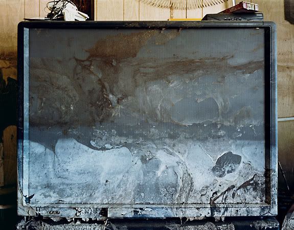
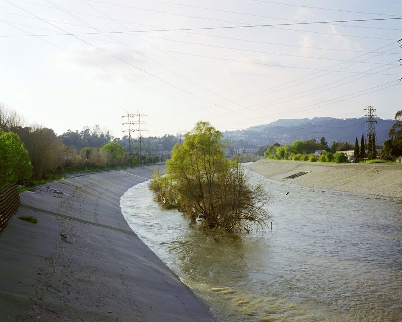
Wyatt Gallery
"TV, Ms. Blackman's House, New Orleans, LA, 2005"
2005
Chromogenic Print
24 x 19 inches
Peer Gallery: In a group show bearing the weighty title, "After," photographers Wyatt Gallery and Radek Skrivanek both include handsome images. Gallery's subjects are not markedly different from those of the other photographers who traveled to Louisiana in the aftermath of Hurricane Katrina, but this doesn't lessen their impact; a good photograph is a good photograph.
Yet I must admit to feeling manipulated when I look at "Direction of Your Dreams, New Orleans, LA, 2005." In the picture, two overturned, weathered school desks rest on a mud encrusted floor below a blackboard and a poster proclaiming, "In The Direction of Your Dreams." I understand that this is real, that the arrangement isn't contrived; furthermore, I'm not adverse to cliche. But even reality can be heavy-handed.
Wyatt's most successful pictures, such as "Ninth Ward, New Orleans, LA, 2005" or "TV, Ms. Blackman's House, New Orleans, LA, 2005," are those that forgo the preachy and show (rather than tell) the extent of the failure. Where he succeeds, the pathos is substantial.
Gallery traveled to New Orleans with another photographer, Will Steacy, who has also produced some stunning photographs. At Peer, however, he includes works from a project that, while more thoughtful than most Katrina related documentation, proved unable to hold my attention.
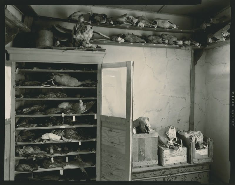
Radek Skrivanek
"Specimen Storage Room, Abandoned Research Camp, Barsakelmesh Island, Aral Sea, 2004"
2004
Toned, Silver Gelatin Print
16 x 20 inches
Skrivanek's project documents another crisis, one on the other side of the globe from New Orleans. The impact of the former Soviet regime on the region surrounding the Aral Sea - and on the shrinking sea itself - has received ample ink in magazines and environmental journals, but I have seen few pictures taking stock of the changes. Skrivanek's lovely black-and-white images belong to the same family as Edward Burtynsky's photographs, although one senses that Skrivanek is more interested in the human scale. Abandoned ships decay like beached whales and forgotten port cranes stand idle, but the few images of forgotten interiors are the best pictures in the show.
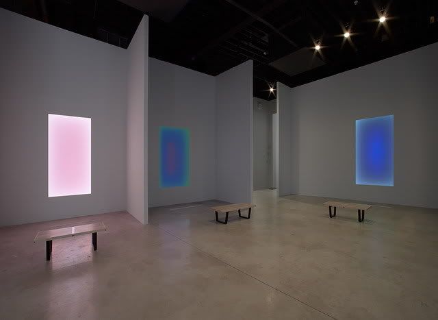
James Turrell
Installation View of Tall Glass works
2007
Dimensions variable
Pace Wildenstein Gallery: James Turrell is considered a contemporary master. His experiments with light and perception are often as beautiful as they are transformative. In "Light Leadings," his current solo effort at Pace Wildenstein, Turrell rewards the patient viewer. The five large works installed in the gallery's front room are from Turrell's Tall Glass series. These works jar our sense of depth perception to such a degree that even when inspecting one of the shallow wall pieces from a revealing angle, one that allows you to perceive the physical construction, you are skeptical of what you discern. The allure of Turrell's light sculpture is not intended to be superficial, of course; he encourages us to look more carefully, more completely, but also to forgo conscious analysis, and to enter a state akin to meditation.
I think it a testament to the power of this work that a group of young college students visiting the gallery ceased chatting and sat rapt on the benches provided. A member of this group, baseball cap cocked to one side and jeans slung low, stood next to me for a minute, studying a pale, subtly undulating rectangle. Finally, he uttered a soft and drawn-out half-sigh. "Fuck." Fuck, indeed, Mr. Turrell. In case you're wondering, that's high praise.
On the other hand, the smaller, holographic - or "reflective" - works in the back galleries don't do much. Where the light emanating from the Tall Glass works feels otherworldly, the holograms seem to be exactly what they are, clever productions. They are neat enough, but neat doesn't cut it alongside the truly transportive.
Pierre Bismuth
Installation View of "One Size Fits All"
2007
Dimensions variable
Mary Boone Gallery: The press release issued by Mary Boone for Pierre Bismuth's first solo exhibition in the United States describes Bismuth as "one of France's foremost artists and a leading figure in conceptual art." I've enjoyed some of Bismuth's games in the past - he was credited as co-writer, along with Michel Gondry and Charlie Kaufman, of "Eternal Sunshine of the Spotless Mind" - and I was curious to see what he would offer viewers here. At Boone's Chelsea location, Bismuth displays the pages from Art in America and Artforum that advertise his solo exhibition, but the pages have been blown up to "gigantic dimensions [that] take over the gallery space." The statement continues, "Whereas normally the magazine serves as a vehicle of expression for the gallery, here the gallery becomes the vehicle for the presentation of the magazine. The artwork and its representation, object and publicity, are conflated." Um, yeah...keep it simple, stupid, as the saying goes. But even if the artist intends to skewer the Art World with this display, this is art for Art World acolytes only; in other words, it's fucking irrelevant.

Starr Ockenga
"Thamnophis sirtalis sirtalis / Eastern Garter Snake"
2006
Inkjet Print
20 1/2 x 13 1/4 inches
Tria Gallery: In her current exhibition at Tria, "Presence: Some Details From A Garden," writer and photographer Starr Ockenga makes several mistakes that might not bother - or even be recognized by - most viewers. In my case, however, it was all I could do not to raise a fuss with the folks sitting in the back room. As regular readers know, I'm a "wildlife guy." I take very seriously anthrozoology, zoology and conservation biology. One area I am particularly interested in is herpetology, the study of reptiles and amphibians. As a result, I know many of the Latin names assigned to various species. So you'll understand my balking when, looking at a photograph of an Eastern garter snake (Thamnophis sirtalis sirtalis), I notice that Ockenga has written on the photograph the Latin name, followed by a note suggesting the snake is part of the "Columbridae" family. Trouble is, there is no such thing as the "Columbridae" family. Ockenga meant to write "Colubridae." But this could be a careless mistake. I was taken aback for a moment, but I shrugged it off and continued on.
Across from this image, however, hangs an attractive picture of a dead green heron (Butorides virescens), the strongest piece in the show. I admired the picture for a moment, then moved in for closer examination. To my dismay, I saw that the artist had identified the bird in the picture as a great blue heron (Ardea herodias). Not only are the two species unrelated, but confusing the two is near impossible. Someone who has gone to the trouble of collecting and photographing the bird should, I feel, take the time to open a bird identification book, especially if they're going to write the Latin and family name on every picture.
The mistakes continue on Ockenga's website. She assigns the milk snake (Lampropeltis triangulum) to the family Leptotyphlopidae. That family is comprised of the blind and worm snakes; the milk snake belongs, like the aforementioned garter snake, to the family dubbed Colubridae. How many more of these errors might there be? I'm not familiar enough with the classification of insects or plants to recognize similar mistakes with those subjects but, judging by the number of errors I did find, the whole enterprise is called into question.
Ockenga may well have the best intentions, and I am always pleased to find artists looking to the non-human world for grounding and inspiration, but I have a difficult time understanding such glaring mistakes, especially on the part of an artist and writer who claims to be so connected to the life of her garden. I tried to forget about the whole thing but, unable to do so, I contacted the artist. To her credit, she replied with a note apologizing for the mistakes and declaring her intent to fix the errors where she can. She also said she is "deeply moved by [the animals'] beauty" and "welcome[s] more knowledge." Reading her reply, I felt torn. On the one hand, my reaction was that of an ass; I lambasted an artist for her lack of seemingly esoteric knowledge, an artist who seems genuinely drawn to the non-human world. Yet, if Ockenga does become more vigilant in her attempts to identify the various species, my frustration with her apparent carelessness may result in some good. After all, the human understanding of - and communion with - Nature is as informed by science as it is an open heart and mind.

Laura Kleger
"Airstream, Runyon Canyon" from "Drive By"
2006
Chromogenic Print
20 x 24 inches
PS122 Gallery: Laura Kleger and Ruby Sky Stiler share a double-bill at PS122 Gallery this month. One of Stiler's sculptures - a hanging, feathered form constructed of paper and glue - is curious enough, but I found myself far more interested in Kleger's photographs, all drawn from her ongoing "Drive By" series.
In her statement, Kleger describes her present home, Los Angeles, as an "ahistorical environment," one marked by a "repetitive climate" in which "individualism reigns over community; nature abounds in strange manifestations of both organic and human design; personal expression proliferates in a place of boundless possibility." The artist's characterization of the city could just as easily be applied to the cultural landscape of America at large and, indeed, although the photographs depict a distinctly southwestern light, architecture and geology, the melancholy that permeates the series may just as readily be found in Maine, Virginia, Kansas or Wyoming. Some days it seems as though it can be found hanging like a rank fog over all the globe. Kleger writes, "Optimism flourishes – but so does its dark twin, unfulfilled expectations." True enough, and when those extremes become the norm, culture hemorrhages.
Although "individualism reigns" in the contemporary zeitgeist, many of us have trouble identifying our own significance, much less the significance of every second, each breath, every molecule. The future and the past are championed over the present at great cost to pragmatic optimism and natural balance. It's naive to believe that "your moment" is somehow more crucial or significant than those that came before, but to deny or play down our present predicament is simply irresponsible.
Kleger addresses this state of affairs in an unconventional way. She turns to the mundane to illuminate the exceptional. Some of the photographs on view at PS122 are considerably less striking than their counterparts. Initially this distracted me. Given the project's premise, however, the mixed bag approach has a logic of its own. Kleger titled the body of work "Drive By" in a nod to contemporary perception. Our heads nod to the rhythm of the road and our eyes flow through a cycle of fast moving images; life in the passenger seat is passive and often thoughtless. But what if you stop the flow at random, on a seemingly innocuous or insignificant snapshot, and really look? Kleger's project encourages us to do exactly that.
Laura Kleger
"Los Angeles River I, Echo Park" from "Drive By"
2006
Chromogenic Print
20 x 24 inches

Anish Kapoor
"Untitled, 2006"
2006
Gouache on paper
26 3/8 x 39 1/2 inches
Barbara Gladstone Gallery: Perhaps the most surprising disappointment of the day was Carroll Dunham's solo outing at Gladstone. I hold much of the work Dunham produced between 1980 and 2000 in high regard, and so hoped the recent work would see him again producing superlative paintings. After reading Jerry Saltz's rousing review, I expected fireworks. Regrettably, Dunham comes up short. The predominantly yellow geometric abstractions are unexciting and the shrill cock/ass/cunt "wanderer" works, while visceral and clear in their wailing intent, sacrifice visual complexity for intensity. It could have worked, but doesn't.
Anish Kapoor
"Untitled, 2005"
2005
Gouache on paper
20 x 36 1/4 inches
By contrast, Anish Kapoor's works on paper in the upstairs gallery at Gladstone knocked my socks off. Kapoor is an artist I have, until now, been utterly bored by. His large-scale sculptural projects and public commissions leave me unmoved. But the radiant works on show here aren't unrelated to those sculptures. As the press release states, "Kapoor's gouaches have been an integral aspect of his practice from the start, and in them the viewer can discern the forms and colors that dominate his sculptural works." My preference for the works on paper, then, must have to do with my belief that intellectual recognition or experience of the Sublime and the Universal - phenomenon central to Kapoor's artwork - must be achieved via the comparatively insignificant. In other words, contemplation of the Grand Canyon from the canyon's edge awes principally at the visceral level, whereas contemplation of an open cut on your hand awes at the imaginative. The very comprehensibility of these works is what allows the viewer to enter the realm of the incomprehensible. It sounds contradictory, perhaps, but the effect is one more instance of the scalar continuum at work. I spent a great deal of time in this room; with Kapoor's works on the walls, it's something of a chapel.
Anish Kapoor
"Untitled, 2005"
2006
Gouache on paper
36 1/4 x 20 inches

Jordan Eagles
"Phase 1 - 2"
2006
Blood preserved on white Plexiglas, resin
72 x 44 inches
Merge Gallery: Jordan Eagles attempts to do something comparable to Kapoor. Eagles says his paintings - that seems the most appropriate description of his work, although they are more precisely a hybrid of sculpture and painting - are "reflection[s] of mortality, spirituality and infinity." In order to heighten these associations, he chooses to work with cow blood. Depending on how Eagles manipulates or treats the blood, it can be opaque or translucent, a deep maroon or a saturated cadmium, a veritable pool or a cracked film. "To use paint instead of blood lacks authenticity," he has said. The young artist's choice of medium has generated a fair amount of attention, good and bad alike, but seeing the work in person it's clear to me that these paintings would not be easily reproduced were he to substitute a less controversial substance. While a similar range of color could be achieved with paint, the works glow as if backlit, absorbing and reflecting the exterior light in a way that paint can not.
Of course, many artists will insist Eagles uses blood because it raises eyebrows. They believe his spiritual couching is little more than a rationalization; he chose the blood to get attention, and then figured out a way to make it seem like the natural choice. I first learned of Eagles' work when a friend sent me a link to a New York Times article about the artist; the email subject line said something to the effect of, "Use Blood, Get Reviews." Personally, my beef with the cow blood is purely conceptual. Keeping in mind that the work is about regeneration and "celebrat[ing] the rebirth process," it strikes me as contradictory to contain the serum in resin, effectively trapping the energy and halting the recycling process indefinitely. Granted, one day that resin, too, will be reclaimed by extreme heat, and the blood will be released in the process, but until that apocalyptic eruption, supernova or asteroid collision occurs, preserving blood in resin seems akin to pumping a corpse full of preservatives before dumping in it the ground.
That complaint aside, I appreciate Eagles' strongest paintings as an exciting fusion of the internal and external. I'm most drawn to his multi-panel or sequential works (none of which are on view at Merge, unfortunately) for compositional reasons, but "UR2" and "Phase 1 -2" are both fine examples of Eagles' graphic ability. In fact, Eagles' strong compositions, coupled with the luminescent quality of the paintings, will likely lead to the work being dismissed by more jaded viewers as mere decoration. Still, stylized and glossy though the blood paintings may be, I believe Eagles is attempting to communicate the transcendental and the elemental. I find the work as promising as it is attractive and I look forward to seeing more from the artist.
Jordan Eagles
"4 Panel Sequence"
2006
Blood preserved on white Plexiglas, copper, cheesecloth, resin
12 x 45 inches
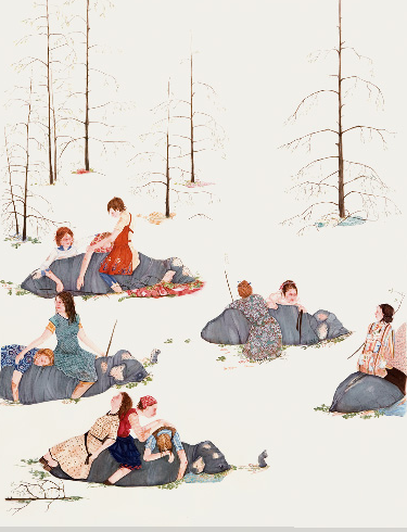
Amy Cutler
"Passage"
2005
Gouache on paper
30 x 22 1/4 inches
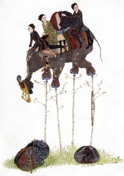
Leslie Tonkonow: I keep expecting to tire of Amy Cutler's pictures. All of her colorful gouache works are variations on a theme (and a rather narrow one at that); they risk predictability. But I am always captivated by them anew, particularly those that display the breadth of the artist's imagination. When Cutler's hardworking women are engaged in more mundane (relative though the word may be in this instance) activities - drying fish, tying bundles of grass, shouldering bound mattresses - I tend to focus on the artist's venerable technique; how she illustrates the scene becomes more important than the scene itself. But when Cutler's all female cast steps it up a notch - donning antler headgear, for example, and using the curious hats to harvest high hanging fruit or assembling on elephant back for a birch-tree stilt ride - I'm enchanted. Happily, Cutler's fantastic worlds have an edge. Cutler's best works belie a sharp intelligence and an acerbic streak while remaining unpretentious and whimsical. That's no mean task, and Cutler proves up to it more often than not.
Amy Cutler
"Elephant Ferries"
2006
Gouache on paper
30 x 22 1/2 inches
I often think of Cutler and Marcel Dzama as two sides of the same coin. Both were born in 1974; both are invested in fairy tales and the surreal; both work primarily in gouache on paper and came to the attention of the Art World around the same time. I've even heard one artist friend joke that Dzama is the male Cutler and Cutler, the female Dzama. Dzama's imagery is a little more bloody and stereotypically "boyish," whereas Cutler uses a more delicate line, refined palette and, some would say, draws from a more sophisticated paradigm. In any case, I quite like the work of both artists and I look forward to seeing how their output evolves.

Delia Brown
"Caprice Toasting Felicity's Painting"
2006 - 2007
Graphite pencil, white gouache on colored paper
19 3/4 x 27 1/2 inches
D'Amelio Terras: I don't like Delia Brown's subject matter and I've never cared for the look of her oil or acrylic paintings so I didn't expect to appreciate her new drawings. But the works hanging in the Front Room at D'Amelio Terras, executed with dexterous elan using colored pencil, graphite and gouache, won me over almost immediately. The first image I saw upon entering the gallery was "Caprice Toasting Felicity's Painting." My eye was drawn around the flower-filled glass vase in the foreground, briefly over the folds of fabric bunched at Caprice's hip and, then, out through the brilliantly illuminated window. I rested there for a moment, where raw paper meets medium, before drifting inward, from left to right, to linger on the fine cheek bones and clavicles of the young artist, Felicity. I was effectively seduced by Brown. Standing there, wearing a goofy, lecherous grin, I remembered that painting and drawing, at their best, trump photography in terms of pure sensuality.
According to the press release, the drawings are "part of an on-going project...[that] tells the story of an emotionally unstable young would-be painter, and her seduction into the arms and lifestyle of an heiress on a constant quest for relief from the tedium of a privileged life. In the drawings, Brown plays the heiress while the actress Hollis Witherspoon portrays the artist." Brown says she uses this series as way "to explore the romantic, social and economic desires of the artist." Felicity, the artist in Brown's series, may be satisfying some of her desires via the arrangement, but her relationship with Caprice - what's in a name? - seems decidedly one-sided.
Delia Brown
"Caprice Apprehending Felicity"
2006 - 2007
Graphite pencil on colored paper
19 3/4 x 27 1/2 inches
The psycho-sexual power plays on show at D'Amelio Terras - be they flirtation (the mildly provocative pose by the collector in "Caprice Installing Felicity's Painting"), financial gifts ("Caprice Treats Felicity to a Hotdog in Front of the Museum") or exhibited moments of miserable weakness ("Felicity Struggling with a Drugged Caprice") - suggest that Brown harbors a general disdain for a certain stripe of art collector. Indeed, even some titles paint the collector as an anxious predator. In "Caprice Apprehending Felicity," Felicity sits outdoors, her easel positioned before her. Caprice, here the veritable icon of urban, mannered wealth (the clothes, the ambivalent way she grips her dog's leash, the size of the dog itself), descends tiered, concrete stairs to approach the artist. Behind her are trees and a sloping hillside. From the looks of it, our actors are in Central Park. The canvas Felicity is working on features two white-tailed deer in a bucolic setting. Given the resurgence of interest in landscape and animal imagery - especially white-tailed deer - among young, contemporary artists, Brown links this subject matter with Felicity, and with naivete more generally. I could only laugh at myself. Brown's subject matter may not much interest me, but I'd wager that mine would bore her.
Outside of her artwork, I know nothing of Brown, and I wouldn't feel comfortable hypothesizing about her motivations. Is this art as therapy? Is this a vicious critique of the Art World's current partiality for youth and investment over wisdom and insight? Whatever the case, casting aside the very loveliness of these drawings, I'm made uneasy by the series. The vampiric relationship between Caprice and Felicity is born of idle time and self-absorption/self-pity. I don't want to like these pictures. I'm not one to avert my gaze from unhappy scenes, but I can't understand why anyone wants to examine such prosaic anguish. But perhaps I protest because I find the whole art game a little unnerving. I was also wooed in the past by a wealthy collector; I know firsthand how polluted such a relationship can become, and how very upsetting it can be for a young, ambitious artist who believes art careers shouldn't necessarily amount to prostitution, be it metaphorical or, in truly tragic cases, literal.
None of my qualms, though, amount to a rejection of the work. It's just too damned gorgeous to dismiss. The same masterly hand I found in "Caprice Toasting Felicity's Painting" is present throughout the series. Another outstanding drawing, "Caprice Admiring Felicity's Painting," shows the artist - the real artist, I mean - again doing wonderful things with clothing and light. Brown's pictures, especially those created on blue-gray paper, are remarkably deep. Because Brown vignettes many of the works, this effect is heightened and the viewer is cast as voyeur. I only wish I didn't have to feel so dirty.
Delia Brown
"Caprice Admiring Felicity's Painting"
2006 - 2007
Graphite pencil, white gouache on colored paper
19 3/4 x 27 1/2 inches
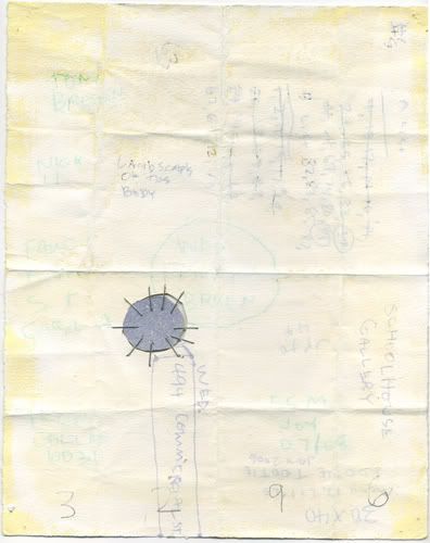
M.P. Landis
"WD3296 (another21)"
2007
Mixed media on folded paper
approx. 10 x 8 1/2 inches
55 Mercer Gallery: Based on the images I'd seen on the gallery's website, I entered 55 Mercer with low expectations. It is perhaps unfair to visual artists - photographers excepted - that we live in the era of the .jpeg, an even flatter experience than that of the slide. Often my decision to see (or skip) a show is predicated solely on the online reproductions. If I'm not keen on the .jpeg, I cross the show off the list. If I lived somewhere other than New York (or any other town with innumerable art galleries), I would be more willing to visit those shows, but contending with countless exhibitions each month, the reproduced image serves as a decent divining rod. But, as water witches everywhere know, divining rods are notoriously unreliable. I'm grateful that a friend recommended M.P. Landis's recent mixed media works; skeptical though I was, I dutifully headed to SoHo and I'm richer for having done so.
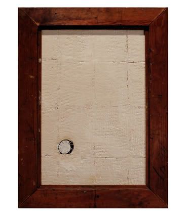
Central to Landis' current project, "Another," are his wood works. For years, the artist has collected old frames. Into these, he inserts wood panels, but he displays the frames backwards, so that the viewer faces the frame's rear, giving the impression of looking into a painting's guts. He paints the surface of the wood panel with a fleshy, monochromatic impasto, then cuts away a section of the wood, paint and all. He repeats the process using different frames and panels of similar size, then attempts to fill the void on each surface, often quite inadequately, with a bit of wood he has removed from another work in the series. The small, roughly circular blocks are forced into and stapled over the orifices. The works aren't immediately pleasing to the eye - which is why they don't have the same resonance in reproduction - but only minutes after I entered their space, the little grey cells were providing all manner of associations. I felt both intellectually thrilled and a little heartsick.
Before learning the impetus of the "Another" series, I viewed the wood works as celebrations of effort (and reason) in the face of seemingly insurmountable odds. I found myself thinking of the near absurdity of theoretical physics, how we create hypotheses to explain or account for phenomena we can only fathom in the abstract. Many of those ideas are essentially plugs in space-time, so-called theories that serve as the finger stuck in the leaky Enlightenment dam.
I don't know what Landis would make of my space-time/reason read, but the official line on "Another" is no less compelling. Not long ago, Landis suffered through kidney failure, dialysis and a kidney transplant. His friend, artist, musician and filmmaker, Tom Abbs, donated the kidney that Landis now carries within. As the press release tells it:
"While Landis was recovering from his recent kidney transplant surgery, he was also going though the emotional process of accepting into his own body the healthy kidney from the body of his close friend...Landis realized that the missing piece in this series was the act of literally taking a piece out of each work and adding it to another...this simple development came slowly, internally, so to speak."
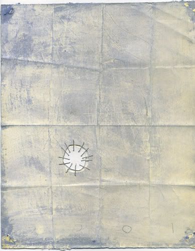
M.P. Landis
"ANOTHER (FOUR)"
2007
Mixed media on wood, frame
21 1/2 x 16 inches
Learning this in no way diminished my initial read. In fact, it confirmed the mystical - theoretical physics is one sort of contemporary mysticism - and heroic aspects of the wood works. Whether you view Landis' surfaces as a more local body - a single organ or animal, say - or one incomprehensible in scale, the plug holds the same significance. "Another" is an aesthetically minimal series, but the works are monumental in spirit.
Landis' works on paper are riffs on the wood pieces, but several of them are equally thought provoking and exciting, if not more so. Consider "WD3296 (another21)." The mixed media drawing includes text that alludes to the artist's transplant narrative. Among scribbled notes of daily chores, numbers and miscellaneous information, all partially obscured by various washes, we see the phrase "Landscapes of the Body." Landis' inclusion of these words raises questions of scale and ownership. What landscape are we referring to? What body are we looking at, and through what lens? Most transplant recipients tell us that when you inherit the living organ of another being, you feel more connected to the world at large, more aware of what is shared and what is essential. It is a wedding to the whole and a freeing from the insular. Landis' moving works extend that transformation more effectively than any other minimal, abstract work I have seen in years. This is a show about a kidney; it is also a show about everything.
M.P. Landis
"WD3301 (another26)"
2007
Mixed media on folded paper
approx. 10 x 8 1/2 inches
Photo credits: Wyatt Gallery image courtesy the artist and Peer Gallery; Radek Skrivanek images courtesy the artist and Peer Gallery; James Turrell image ripped from the PaceWildenstein website; Pierre Bismuth image ripped from the Mary Boone website; Starr Ockenga image ripped from the Tria Gallery website; Laura Kleger images courtesy the artist; Anish Kapoor images ripped from the Barbara Gladstone Gallery website; Jordan Eagles images ripped from the Merge Gallery website; Amy Cutler images ripped from various websites; Delia Brown images courtesy D'Amelio Terras Gallery; M.P. Landis images courtesy the artist
A Quick Note on Image Use/Quality: When assembling these gallery reports, I don't always ask the gallery or artist for images, hence the number of "ripped" credits that follow the review blurbs. If the gallery website has an image that will serve my purposes, I'll use it, no questions asked. Ripping ensures I'll have the image immediately, available for use as I need it. That said, I always contact the gallery or artist if the images available online are not high quality.
Unfortunately, some galleries never respond to my image requests. Even after follow-up emails and phone messages, a few have failed to so much as send a line letting me know that they're not interested in providing me with .jpegs. Frankly, that sucks. I realize art blogs are still on the fringe of reputable gallery radar, but I'd think most artists would want the coverage, good or bad.
At any rate, all this to explain that I'm sometimes forced to rip a lesser image. I apologize to the artists in these instances. More importantly, I owe a big thank you to all the artists and galleries that have been a pleasure to work with. I very much appreciate the enthusiasm shown by some dealers, gallery personnel and artists. We're all in this together, so it seems like there should be more of that.
10 comments:
I think it's hilarious that we could both crawl Chelsea less than a month apart and only see one show in common. I'll have something up about James Turrell in a little while; perhaps if you'd seen it with a hologram expert (as I did), you'd have found it more interesting. Maybe not.
you shur do write lots.
Chris:
That's Chelsea for you. And, yes, seeing the Turrell works with a hologram expert may have added another layer of appreciation, but I doubt it would make the work any better for me.
Anonymous:
Accurate and concise, your comment. Thanks.
Hi HH, just wanted to throw my two cents in about Delia Brown. One cent: I have such an unpleasant gut reaction to her colors and style, looks like a cheap, bad greeting card from the 70s and is inherently depressing to me. Two cents: These works remind me of Mary Cassatt and the darker undercurrents she exhibited in many of her paintings (and that most don't recognize).
OK, three cents...I've been thinking a lot of the idea of the female gaze, something I've seen quite a bit of lately, and would like to write about and I feel like Delia Brown "gets it," too.
OK...back to work. (really enjoy your blog)
Rieger, beautiful as always.
I always ask galleries before I take photos and then usually shoot them an email once I've already posted a review.
(a bit after the fact, but truth be told, I'm all for freedom of the press)
If they snooze on the response, go for it.
It's their fault for not following-through.
So far only 1 extremely snobby gallery assistant has told me an outright NO on posting images and reviews.
Everyone else seems to gradually be adjusting-- and some actually now asking for a review.
Free publicity is free publicity.
PS-- I have linked to you, will you link to me?
(my try at artistic and self-aware bribery)
Hope Spring finds you well!
Olympia
Tree:
Thanks for the thoughts. I totally agree regarding Brown's past work. It's absolutely repulsive - subjectively speaking ;) - both in terms of content and formal concerns.
This group of drawings, however, has something more potent going on. I'm still pretty sure I don't want to like it, but they just work so &@%#! well. I'm sold, I suppose.
Oly:
You're too kind. But you reversed the "i" and the "e" in my name, presumably because you know the pronunciation is Rye-ger. Because the spelling remains original (Germanic), however, a lot of folks pronounce it "Rigger." Nope. Like nye-ther and eye-ther, it's Reiger.
I thought your blog was already linked in the blogroll. Absence corrected.
Anish Kapoor and Amy Cutler are good. Thank you.
Chris,
Thanks for the roundup - really enjoyed reading this. I like Amy Cutler a lot. I remember her artwork really standing out at the 2004 Whitney biennial and you have rightly acknowledged her.
If the maxim 'art for social change' were a reality, then the haunting images of the aftermath of Katrina would have fuelled faster development. Looks like everyone could not care less. Wyatt Gallery’s images reinforce but will only serve as documentary.
Thanks again for the roundup. Always enjoy this stuff. Looking forward to new paintings from yourself.
Thanks, Reeeeger.
:)
Me can't spell sometimes.
I'm lazy so far this week-- wanted to post re: the Matta-Clark exhibit at Zwirner, but too uninspired by it.
I liked how you posted how the big reviewed shows are disappointing-- Dunham, etc.-- but the gems are the ones you'd originally written off.
I find that all the time as well.
Later, c.r.
Thanks for the add.
Oly
Post a Comment