+++++
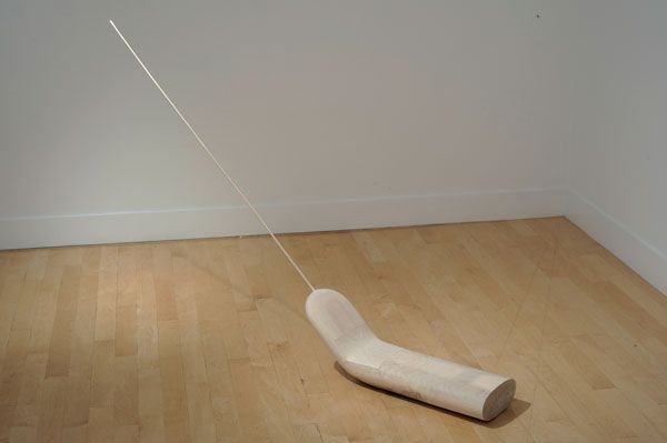
"Narwhellian"
Seth Koen at Gregory Lind Gallery

"Djiril"
2010
Wood
43.25 x 72 x 8.25 inches
Sculptor Seth Koen produces work that appeals in equal measure to my formal sensibility and my imagination. Viewers who prioritize craft will delight in Koen's refined and sensuous surfaces and formalists will applaud the forms' casual elegance. As playful as they are soulful, some wear knitted contraceptives or melt impossibly while others limn space's transcendental properties almost as effectively as a James Turrell light work.
My principal pleasure, though, is considering what the esoteric objects might represent or be. The artist avoids didacticism -- he shows instead of telling -- and the sculptures are more open-ended and interesting as a result. Are they abstracted totem animals, as the exhibition's title, "Narwhellian," might suggest? Are they instead the tools or ritual objects of some unknown, aboriginal population? Or are they sophisticated, conceptual responses to our contemporary political predicaments, another reading of the show's title? The answers, of course, are supplied by each viewer.

"Medusa" and "Arachne"
2010
Wood / Wood and thread
63.5 x 5 x 7.75 inches
69 x 6 x 6 inches
+++++
"Incidental Objects"
Andy Goldsworthy at Haines Gallery

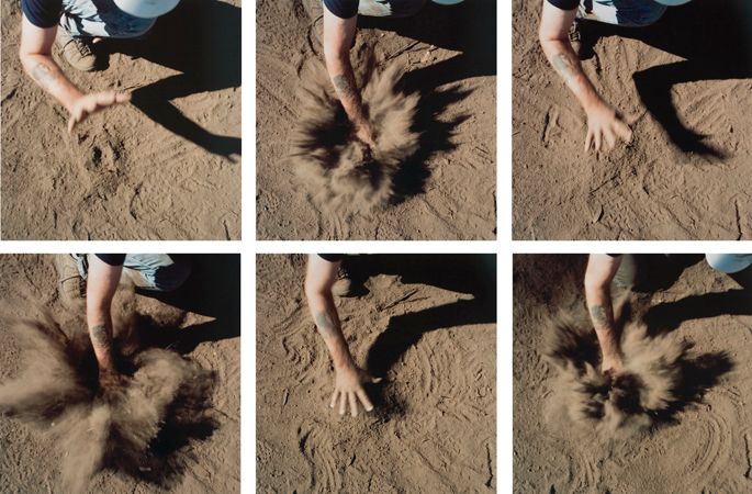
"Hand hit site dust, Presidio Spire, October 2008"
2008
6 unique C-prints
16 x 16 inches, each
Could it be that Andy Goldsworthy is at last taken seriously? These days, I don't receive as much grief as I used to when I admit that I admire much of Goldsworthy's effort. Perhaps the self-conscious, punishing cool of conceptualism is finally beginning to wane, making room for artists who aspire to the sublime and wear their Romantic and mystical impulses like badges of honor? Whether or not Goldsworthy's work is taken seriously by his contemporaries, however, it is no less important. That's not to suggest that all (or even most) of the artist's output is particularly notable; nevertheless, when Goldsworthy connects, he produces profound and potent work.
A few gems are included in "Incidental Objects," his current show at Haines Gallery. The strongest work in the show is a series of photographs titled, "Hand hit site dust, Presidio Spire, October 2008." The photos document an unremarkable gesture captured in six frames; the artist smacks dry, dusty ground at the site where his "Presidio Spire" sculpture would later be constructed. By presenting the action in a Muybridge-style sequence, Goldsworthy invites the viewer to ruminate on the significance of the crude, abrupt mark-making; in so doing, he invests the unremarkable with significance or, as the exhibition's title terms it, the "incidental" is rendered radically full of meaning.
Few artists are so interested in getting dirty. Playing in the mud, Goldsworthy asks vital questions about our contemporary relationship to terrain, ritual, time, and natural processes. It's interesting, then, that video and photography, mediums we associate with an anthropological remove and even sterility, are the artist's most effective means of documentation and presentation.
+++++
"Recent Paintings"
Stephen Beal at George Lawson Gallery

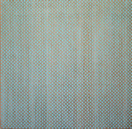
"untitled"
2010
Acrylic, gouache, and graphite on wood panel
31.75 x 31.75 inches
In the Bay Area art community, Stephen Beal might be better known for his regional academic and managerial activity than for his artwork. Like many other working artists, Beal is a college professor, but he's also the active President of the California College of the Arts (CCA), a Board member of the Yerba Buena Center for the Arts, and Board President of the Creative Growth Art Center. Impressive and laudable though his contribution to Bay Area arts is, I'm pleased to report that his show of recent paintings at George Lawson Gallery proves he's an artist who "sunlights" as an arts administrator rather than an arts administrator who moonlights as an artist.
All of Beal's paintings hum and vibrate, and his brightly colored works crackle with energy; generally, however, his strongest pieces are understated, more Om than bug zapper. Admiring "untitled" (pictured above), Beal's repetitive, paced process calls to mind the meditative work of Agnes Martin. The finished, undulating picture, however, relates more to Mark Rothko's transcendental canvases. (Tweeting contemporary benefactors: "21st Century Chapel, Anyone?" But, until Daddy or Momma Warbucks steps forward to give Beal a permanent space to transform with his pictures, his work will transform one collector's wall at a time...and that's no incidental thing.)

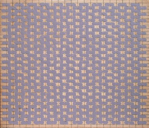
"untitled (sb03)"
2010
Acrylic and graphite on wood panel
8 x 9 inches
Image credits: all images, courtesy the respective gallery websites

8 comments:
Glad you are settling in, but disappointed in what shows up there. The Bay area is the home of many great colorists, like Diebenkorn, Francis, and Still. But it has gone the way of all contempt art, wheres the passion?
Color is harmony, and links us to the organic and nature. These are purely sterile mental, of man alone, no God or nature involved, yet supposedly about nature. WTF?!
Need growth, decay, texture and layered ecological systems to be of life. Its sad where art has gone, irrelevancy. Sorry. My backyard has far more to reveal to me than this. In a constantly evolving and involving way. Though the birds were quieter this summer, except for that flock of parrots which just flew over. Even the squirrels have been tame and on the down low. Kids too, whats up?
Color. Its all about color, the harmony of life with the line/melody of mans ideas and structure/rhythm of God's pulse. Where is creative art when it is so sorely needed?
art collegia delenda est
Donald:
I appreciate color as much as the next guy (or at least I like to believe that I do!), and my response to the work is obviously rather different from yours. Before writing off the work, I encourage you to see them in person.
Donald, I've read your response several times and still cannot make sense of it, except to say that you are frustrated by "modern", i.e. 'not cozy pictures of the wild backyard images' in contemporary art. Growth, decay, texture and layered ecological systems are all ideas you can take away with Beal's work also, but only with a little more light on the noggin. I also think that anyone who made "untitled" has to have some serious passion to make that sh*t. The passion is there, just not the god or other cliche images of nature.
Donald you do seem down, but nonetheless I feel you're echoing a mediocrity which I am and have been finding all too often in my studio visits just as frequently as I have in society and yes even 'nature' (or what passes for nature in a city-dominated world). Your post reminds me of a song I never much liked, but which had a great title, "Everything is average nowadays." As Christopher says, perhaps one can't really speak on these with full qualification until going in person, but your post was touching.
Nonetheless I really appreciated your take on Andy Goldsworthy to no end dear Christopher. I have never seen a video of it, and as you say (although I will go much further) who gives a damn if anyone takes him seriously? And who are we talking about anyway? A bunch of theorists posing as art-critics no doubt, although I'm sure you'll tell me that's extreme on my part :)
He is rubbing his hands in sand, and it is as deep and meaningful as we the viewer may wish it to be, but one thing I find it not to be is pretentious; just as one thing I find it to be is humble.
Many also found Michael Jackson's 'Earth Song' video to be incredibly corny when it was first released in England- I believe in December 99- but what always remained for me was the simple act of his plunging his hands into the dirt, and his having all the other people in the video (of races around the world) do the exact same. I invite you to watch and if there are parallels with monsieur Goldsworthy then so be it!
Thanks for the great review.
YM.
http://mp3.zing.vn/mp3/video-clip/xem-video/Earth-Song-Michael-Jackson.1936.html
Donald Frazell made this reply, and I'm not sure why it isn't appearing online, so I'm pasting it now.
"
These are not Modern, they are but single layers of life. Showing ones own hands is reminiscent of Oral Roberts and his huge sculpture of his own hands, something truly blasphemous to anything we would call God. It is not about that person, we as individuals are irrelevant, it is the continuation of lfie, and most importantly to Us, our spoecies. Nature adn God continue with or without us. As Voltaire said, tend to your garden. There is no life here, just dead dirt so only the hands are left, highlighting the person. Go to your garden, there is life. Reap, but one must first sow.
The problem is that contemporary atists work in steirle white confines, always white walls, when works used to be in an environment, working with others. Modern art from the time of Constable and Turner was worked outdoors, ones work must stand up to nature, take it outside. works now are designged for sterile surrounding, not fertility.
Even before we worked in interior enviroments, colors of others were everywhere, the Sistine ceiling was made with frescoes already on the walls, it was not alone. Art now is seperate, and not made for life, but a strict academic mentality. Modern artists did not work in white rooms, except Matisse at the end for a backgroundn for his cutouts. Look at old photos, they always have tinted walls, one cant tell because they are BandW, but color is harmony, passion, and incorporates all in a life force. The narwhale above looks like a mockup of a old cellphone developed at some applied arts school. Take it outside, and what is it? Take it in your house, and unless made into an Icon, esconsced in a nook to give it more meaning than it truly has, it will get lost as if a childs toy. It has no soul, just an illustration of a man made idea. Which pales before the Universe.
We aint all that, humility comes first, these are about the artists cleverness, not of life. Click on my name and check out my site, I work in the open, never in white, and so their textures and un"finished" appearance look primitive in a sterile white space, but enliven any true living area. Art is not for academia, it is for life. We work From ideas and theories, not towards them.
Line is melody, color is harmony, structure is rhythm, lets to make some music."
Yusuf:
Thanks for your thoughts. MJ's video isn't my cup of tea; the music didn't go down much more easily! I sense that "the King of Pop" meant well, and I salute him for his good intentions, but the "artfulness" of both the song and the video are, to my perhaps too judgmental eye, lacking.
Like you, I appreciate a good hand-into-dirt plunge, but there's a substantial chasm between melodrama (MJ's hand-dirt moment) and "ritual-like" gesture (Goldsworthy's hand-dirt moment).
I'm not an elitist (at least, I hope not!); in fact, I would have preferred to connect to MJ's more popular dirt grab. Unfortunately, that didn't happen. My less favorable response to MJ's "Earth Song," though, in no way lessens the Jackon-Goldsworthy parallel you made.
Donald:
"Blasphemy" to include the human hand in the work? Surely you consider man part of the greater universe, an infinitesimal mote in the unfathomable whole? Moreover, the dirt in the Goldsworthy pictures is hardly "dead"; dry and dusty, yes, but not dead in any holistic view. It is merely one stage of the cycle.
Andy Goldsworthy almost always creates artwork outdoors, where the works then remain. The artist and his work are rarely in "sterile white confines" except for his gallery showings. If I follow your argument, surely Goldsworthy's work, constructed or performed outside and typically remaining there, is more humble and natural than the paintings (displayed indoors) that you and I produce?
The comment that I reference in my response above is pasted below. For some reason, Donald's comment keeps failing to appear here.
"These are not Modern, they are but single layers of life. Showing ones own hands is reminiscent of Oral Roberts and his huge sculpture of his own hands, something truly blasphemous to anything we would call God. It is not about that person, we as individuals are irrelevant, it is the continuation of lfie, and most importantly to Us, our spoecies. Nature adn God continue with or without us. As Voltaire said, tend to your garden. There is no life here, just dead dirt so only the hands are left, highlighting the person. Go to your garden, there is life. Reap, but one must first sow.
The problem is that contemporary atists work in steirle white confines, always white walls, when works used to be in an environment, working with others. Modern art from the time of Constable and Turner was worked outdoors, ones work must stand up to nature, take it outside. works now are designged for sterile surrounding, not fertility.
Even before we worked in interior enviroments, colors of others were everywhere, the Sistine ceiling was made with frescoes already on the walls, it was not alone. Art now is seperate, and not made for life, but a strict academic mentality. Modern artists did not work in white rooms, except Matisse at the end for a backgroundn for his cutouts. Look at old photos, they always have tinted walls, one cant tell because they are BandW, but color is harmony, passion, and incorporates all in a life force. The narwhale above looks like a mockup of a old cellphone developed at some applied arts school. Take it outside, and what is it? Take it in your house, and unless made into an Icon, esconsced in a nook to give it more meaning than it truly has, it will get lost as if a childs toy. It has no soul, just an illustration of a man made idea. Which pales before the Universe.
We aint all that, humility comes first, these are about the artists cleverness, not of life. Click on my name and check out my site, I work in the open, never in white, and so their textures and un"finished" appearance look primitive in a sterile white space, but enliven any true living area. Art is not for academia, it is for life. We work From ideas and theories, not towards them.
Line is melody, color is harmony, structure is rhythm, lets to make some music."
Havent seen any of his work, just a pile of leaning dead trees, thats wasnt much, more like a bonfire at a Texas AandM pregame rally. That is just dust, like it had been gone over by trucks and such it isnt natural at all. No clumps, no twigs, no leaves, no decay or growth of any kind.
the personal hand thing is a way to worship oneself, in painting it loses any connection to an individual, in film it is of that particular person. Oral Roberts was terribly arrogant, and perhaps why the hospital has failed. It was all about him not god, not a need of humanity, and not of natures calling.
And the Presidio is hardly nature. While I find earthworks arrogant and destructive not the environment, if you call some military base in a city nature, well, i got some swampland for you. Its pretty lazy. man has ruined that dry patch of earth, while we are part of nature, when we take over completely we destroy the layered environent for life to grow. That was pretty sterile, more like a sandbox for play than art. A little more effort would be nice.
Post a Comment