As usual, rather than write reports on everything I saw, I highlight only a very few exhibitions below. But first, breaking from the usual format, I've decided to give passing mention, cruel though it may seem, to the duds of the day. Judith Eisler's "television" paintings at Cohan and Leslie Gallery are insipid things, though, to be fair, they may have been exciting a decade ago. Just next door, at Alexander and Bonin, Stefan Kurten's fading landscapes of a vaguely European suburbia would make excellent gifts for despised, wealthy mother-in-laws - and this harsh critique comes from someone who adores landscape painting. Charline von Heyl's acrylic paintings at Friedrich Petzel are about as bland as can be although, curiously, they work better in reproduction (on the gallery's website, for example). Huma Bhabha has three clusterfuck sculptures on view at the small ATM Gallery; I'm all for naivete or primitivism, but Bhabha's work can only be dubbed retarded. The much touted Bendix Harms exhibition at Anton Kern, "Solid As A Rock," falls far short of the mark. There are a couple of reasonable works hanging, but I agree with The New Yorker's assessment: "as sappily sentimental as a greeting card." Furthermore, the majority of Harm's over-sized paintings are crude in the most unappealing way.
Fortunately, not every exhibition was bad; most of what I saw was merely forgettable. And, no, I won't attach this negativity to my being sick; I was actually feeling rather upbeat, all things considered. It's just par for the course on a typical Art World afternoon.
A few artists piqued my interest, even though I don't have much to say about them yet. Scott Anderson has a painting included in a small group show at Freight and Volume. After some nosing about online, I came across this page of older works by Anderson. Cartoonish, dystopian sci-fi is "in" these days, and one can easily stroll past such a work without registering it, but Anderson's paintings, many of which look like a World's Fair gone awry, are more interesting than most. I was less taken with Jin Meyerson's oil and acrylic paintings at LFL/Zach Feuer, though I sympathize with the impetus. Meyerson produces big, colorful "frantic moments," but, so far, I smell too much Photoshop. The compositions were strong, though, and I'll definitely keep my eye on this relatively young artist.
Thankfully, four shows were particular exciting. I plan to write on each of them in more detail in future posts. For the time being, I'll just list them. Feigen Contemporary, a space which almost never puts on a good show, has a very interesting, if schizophrenic group show on display. "Blessed Are The Merciful," curated by Jerome Jacobs, is hit-or-miss - absolute shit rubs elbows with some real stunners - but it is a pertinent show ...maybe even an "important" one. Several of Julie Heffernan's new paintings at P.P.O.W. are remarkable, and the show, "Heaven and Hell," satisfies overall. A number of Lee Baxter Davis's mixed media works at the CUE Art Foundation are fantastic and his work merits repeated viewings. Frankly, I was dismayed to learn that this was his first solo exhibition in New York. The fourth show, Robert Gutierrez's new work at Sixtyseven is "blurbed" below.
+++++
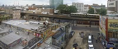
"5 Points, Long Island City, 2004"
2004
Pigment Ink Print
20 x 48 inches
(The image above is woefully small; Julie Saul Gallery never replied to my request for larger images.)
Julie Saul Gallery: Digital photography startles the eye, bringing every object in the frame into sharp focus, no matter how distant. Jeff Chien-Hsing Liao's panoramic views of and from the 7 train are an excellent case-in-point. In "5 Points, Long Island City," one of my favorite photographs on display at Julie Saul Gallery, the graffiti covered walls in the foreground are vibrant and clear, but so, too, are the striped smokestacks of the KeySpan facility reaching skyward to the northwest. Likewise, traffic signs many blocks from the camera's vantage point remain sharp enough to be read with ease, if you feel so inclined. This clarity, in combination with a saturated palette, can discombobulate viewers, resulting in a dream-like experience. Interestingly, Liao shoots several pictures of each prospect and combines them as he sees fit, a common practice among young digital photographers, but one Liao excels at; before reading about his process, I didn't suspect any such manipulation. I'm sure part of my appreciation for these photographs is tied to my own time in Long Island City, Queens, where I kept a studio for two years, but, that connection aside, these are striking images that encourage prolonged contemplation.
+++++
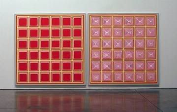
"Red Diptych II"
2005
Acrylic on Canvas
72 x 146 inches
Paula Cooper Gallery: I have no beef with artists who argue that art is principally decorative, but I prefer my decoration to pack a conceptual or technical punch Dan Walsh's abstract paintings are passive creations, incapable of forming a fist, even if they do allow for a little Albers-like optical fun. After any satisfaction derived from visual play wears off, however, viewers are left with Art World IKEA, the perfect compliment to pastel couches and saturated, retro rugs. I'm more of a Wunderkammer guy, myself, and even the Dwell magazine reader in me can't get off on these paintings. Since surface is of little concern to Walsh - despite the gallery's claims to the contrary - I'd suggest he turn these paintings into considerably smaller prints, producing high volume runs. He'd certainly gain more of an audience and his color experiments could continue uninterrupted.
+++++

"Smoke"
2006
Fiberglass sculpture, sound system, projectors
72 x 72 x72 inches
Metro Pictures: The latest offering by Tony Oursler is a disappointment. The basic approach remains the same: mouths and eyes are projected onto lumpy, cartoonish blobs and the accompanying soundtrack is, as always, a schizophrenic monologue of postmodern woes and fears. (As the press release describes it: Oursler uses mercurial elements to describe "the present moment in America...of constant flux and lack of solidity...") This time 'round, Oursler has provided a context for his haunted grotesqueries by placing them in front of "atmospheric wall projections" and adding "noise" to his audio tracks; the voices are now adrift in a vacuum. Unfortunately, whereas Oursler's recordings were once foreboding, today, they're just confirmation of our shared wretchedness. A few years ago, Oursler's melancholy, frightened creations kept us transfixed, but on Saturday most gallery visitors nodded and walked away after only thirty or forty seconds. We know what these disintegrating forms are kvetching about and communion is never as good without wine and finger foods.
+++++
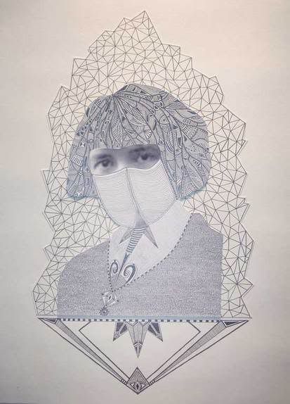
"The Mansfield Disguise"
2006
Collage and Graphite on paper
11 x 14 inches
Bellwether Gallery: "Trifecta," a group exhibition that just closed - I caught it on the final day - was a mixed bag. The show's standout was a collage/drawing by Timothy Marvel Hull, entitled "The Mansfield Disguise." It's straightforward enough, but is every bit as successful at communicating our contemporary anxiety as Oursler's recent efforts; what's more, it's damned attractive. I was also interested in the awkward paintings of Paul Green, hanging in the rear of the space, under the heading, "Hysterical Realism." I have been referring to my own recent landscapes as "hysterical transcendentalism," and I found curator Becky Smith's choice of the word "hysterical" curious. I think we can expect to see this word popping up more and more frequently in Art World discourse.
+++++
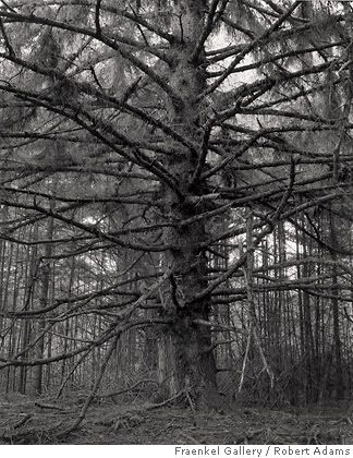
"Sitka Spruce, Cape Blanco State Park, Curry County, Oregon"
1999-2003
Gelatin Silver Print
16 x 20 inches
Matthew Marks Gallery: "Turning Back" is a sprawling exhibition of recent black-and-white photographs by Robert Adams. (Like Bellwether's "Trifecta," the show closed on Saturday.) The subject matter - "inspired by the bicentennial of Lewis and Clark's journey across the Northwest territory to the Pacific Ocean" - is right up my alley, and I enjoy the pictures as documentary. They would make great illustrations for a lengthy essay on the meaning of contemporary landscape and conservation, but as stand-alone works of art, they miss the mark. There are a few exceptions, however. Most notable is "Sitka Spruce, Cape Blanco State Park, Curry County, Oregon," which draws viewers in with it's radiant composition and warmth while also appealing to our base need for shelter and refuge. I feel this exhibition would have been better served in a more intimate venue. Adams's photographs, small in scale, struggle to hold their own in the airy surroundings of the expansive Matthew Marks gallery space.
+++++
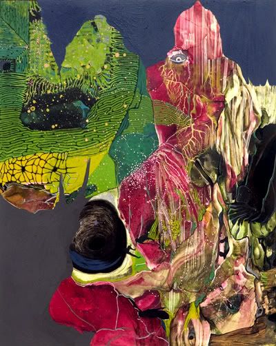
"untitled (Horseman)"
2006
Mixed media on panel
20 x 16 inches
Sixtyseven: I'm a big fan of Robert Gutierrez's "fever atlas" show, currently on display at Sixtyseven. A year ago, when I first saw reproductions of his colorful, subtle paintings online, I was surprised by the small dimensions. Most of his biomorphic landscapes feel expansive and, given the "bigger is better" attitude of so many contemporary painters, I assumed Gutierrez's works would dwarf the viewer. Not so. Most of his works are no bigger than a sheet of loose-leaf paper. I worried that perhaps this was too small. Would I be able to navigate the paintings in the way I desired? On Saturday my fears were put to rest. Give these small paintings some time. Gutierrez's forms bleed and morph into one another, changing scale - is that an eye or a cavern? - as often as they do substance. The strongest work in "fever atlas," "untitled (Shaman)" is, at a cinematic 14 x 33 inches, also one of the largest. I spent several minutes with the piece. These paintings are like precious stones: familiarity and patience are rewarded. I admire the painter's ability to allow the medium to "do it's thing" in places, before reigning a blob or drip into some semblance of representation. The resulting effect is alchemical and absolutely stunning.
Photo credits: to each of the respective galleries, thanks!