
This Gallery Report will be posted in several parts, appearing separately over the next couple of weeks.
The first installment, below, deals with four shows that, for one reason or another (or one artist or another), I liked. The forthcoming posts will discuss a group show at RARE, a tribal art exhibition at Betty Cuningham, and Michael Light's exceptional aerial photographs and bookworks on display at Hosfelt Gallery.
Note: In the interest of full disclosure, I went to graduate school with two of the artists highlighted here. I've been able to see the work of Amy Talluto and Doug Morris develop over the last five or six years, but I don't believe I allow these personal associations to bias my opinion of their work, dubious though the claim may seem.
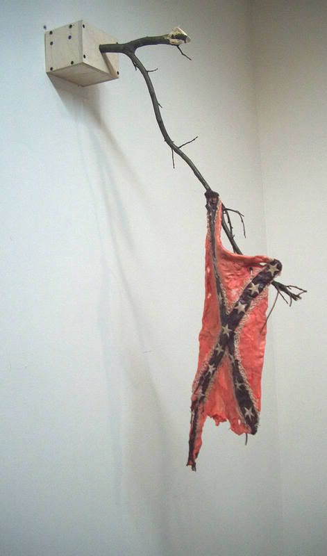
David Kennedy-Cutler
"Dying of Not Dying"
2005
Bubble gum, tree branch, wood
42 x 19 x 9 inches
Morgan Lehman Gallery: This being summertime, New York's galleries are predominantly occupied by half-baked group shows, and so "Promised Land," curated by Elizabeth M. Grady of the Whitney Museum, stood out on paper. The exhibition "[addresses] the recent upsurge in art dealing with 'American' imagery" and "the invention of a national identity." This should be exciting, complex stuff!

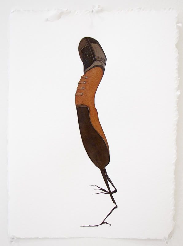
Kimi Weart
"untitled"
2006
Graphite and neon paint on paper
51 1/2 x 89 inches
The strongest pieces in the show are the most iconoclastic, even though their critique is also the most general. Perhaps they work because the artists' broad stroke approach allows the viewer some wiggle room? If artists offer too pointed an allegory or critique, the work becomes almost pedantic. Indeed, the more "clever" works in "Promised Land" suffer for this very reason. Instead, it is the artworks that take advantage of more obvious imagery -- those that, were I to have them described to me before having seen the show, would sound almost trite -- that are the most successful. In this group I would include pieces by Kimi Weart, Aaron Morse, and David Kennedy-Cutler.
Marcia Kure
"012"
2006
Kolanut pigment, watercolor, pencil on paper
15 x 11 inches
BravinLee programs: Aptly called the "Vogue Series," Marcia Kure's works on paper are as chic as they are charming. Frankly, it's a bit surprising to see these whimsical, freely handled kolanut pigment, watercolor, and pencil drawings in Chelsea. They aren't a far cry from some steampunk costume design, the sort of thing you might find under the Extras menu on a DVD. Kure presents us with space cowboys, Victorian walrus men, and robed birds vaguely reminiscent of Henson's Skeksis. Personally, I love it, but a slew of my arty friends, the same bunch that uses "illustration" as a four-letter word, would shrug the show off. It's their loss.

Marcia Kure
"0.5 Tons II"
2006
Kolanut pigment, watercolor, pencil on paper
15 x 11 inches
My favorite drawings on display - there were at least forty works included - were Kure's most original creations, or at least those most unfamiliar to me. "0.5 Tons II" pictures a brainy she-male, and could be interpreted as an allegory of the tortured artist as Tiresias, and "012" seems to be the product of a menage a trois involving Marvin the Martian, a long-legged sparrow, and a hot dog. When I visit a show like Kure's, I pity those art viewers who are unable to appreciate whimsy; these small works are a joy to look at.
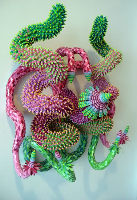
Doug Morris
"untitled"
2002
Ribbon, foam, paper
approx. 24 x 30 x 18 inches
David Krut Projects: I very much like Renee Ricardo's curatorial impetus for HOMEGROWN. "18 emerging artists and art collectives from Boston, Los Angeles, Miami, New York, and Seattle" are included, all of whom "[take] cues from such homegrown practices as collage, quilting, crochet, embroidery, cross-stitch, and assemblage." Unfortunately much of the work on hand seems gestative yet, as though these artists might wow me five years out. But Margaret Lee, Jon Rosenbaum, Anne-Francoise Potterat, Doug Morris, and Erika Somogyi are exceptions and, of this group, Morris's work is the strongest.
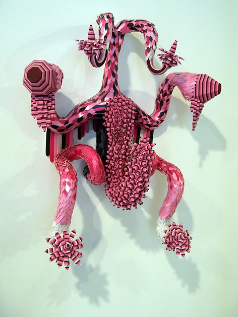
Doug Morris
"untitled"
2006
Ribbon, foam, paper
approx. 18 x 16 x 8 inches
The gallery press release states that Morris "[pulls] imagery from many sources - ranging from Mexican folk art to a vacuum cover made by his grandmother." To my eye these brightly colored, impish creations are as closely related to molecular structure diagrams, Bosch's demons, and Hentai as they are pinatas. But whatever Morris's sources, the sculptures are playfully lewd and aesthetically seductive.

Amy Talluto
"Burn 2"
2006
Pencil on paper
11 x 14 inches
Black & White: On the whole "En Plein Air RELOADED," a promising group show at Black & White Gallery's Chelsea location, falls flat, the result of concept trumping execution. Each of these artists is invested in their work, but as a viewer I struggle to establish the sort of connection I have come to expect from successful investigations of landscape.

Amy Talluto
"Blue"
2006
Oil on canvas
48 x 36 inches
The best landscape art, broad and ambiguous though the classification may be, shows more than it tells, granting the viewer an opportunity to experience land anew or in a heightened state - as in works by Caspar David Friedrich, Thomas Cole, or Robert Smithson - or offering us glimpses of worlds we may not know or haven't had a chance to contemplate - an Edward Burtynsky photograph, for example. Most of the work included in "En Plein Air" "subverts the traditional genre of landscape," as the press release puts it, by foregrounding the sub-text. The experiential aspect of these landscapes is largely erased in the process (or made artificially alien and off-putting in the case of Fiona Gardner's ultra-sharp photographs of Southern belles in a Florida theme park).

Amy Talluto
"Burn 3"
2007
Pencil on paper
10 x 13 inches
Amy Talluto's inclusions are an exception. Regular readers know that I very much like Talluto's paintings - even Art Fag City referenced my affection for her work - but I didn't realize just how accomplished Talluto's drawing has become. As far as I'm concerned, "Burn 2," "Burn 3," and "Blue" stole the show. I'm eager to see Amy's next solo outing, whenever it may come.
Photo credits: David Kennedy-Cutler and Kimi Weart images ripped from Morgan Lehman webiste; Marcia Kure images courtesy BravinLee; Doug Morris images taken by Hungry Hyaena; Amy Talluto images courtesy artist
2 comments:
Amy Talluto is super. Loved the work (guess I have a weakness for works such as these). Burn 3 is a great piece. Doug Morris looks intriguing. Thanks for introducing me to those works of his - I will try and see the show before it ends. I did not think much of David Kennedy-Cutler for some reason - although I thought 'Angst' was very good. His proposals for WTC replacements were whimsical.
"Personally, I love it, but a slew of my arty friends, the same bunch that uses "illustration" as a four-letter word, would shrug the show off. Their loss."
Ha. :) I know those types. . .
Amy Talluto is great. To see such different works from the same artist on the same theme is rather disconcerting yet impressive.
Post a Comment