
Now that the "We're Back In Black" (and tight jeans) frenzy has quieted, however, and most artists have been reminded of why they retreat to the studio to begin with, I've been visiting exhibitions in both Chelsea and Williamsburg. I'm happy to report that there are plenty of good things to see, so many, in fact, that I don't have the time or patience to write about all of them. Below, I focus on only seven shows that stuck with me.
In past Gallery Report posts, I've been very critical, unwilling to refrain from saying exactly what I thought. After talking with a number of artists and curators, I've decided to focus more on work I appreciate. The Art World is a relatively small place and one in which I hope to find some sustenance, so that I can continue making my own work, even after I leave New York City. Personally, I find harsh critique amusing, almost comforting - someone really hates my work - but I've met no shortage of artists who take it seriously, including individuals I've attacked here in the past.
I don't regret having written what I did and I stand by it - I'm extremely opinionated and always game for some verbal pugilism - but neither do I care to count many artists, curators or dealers among my enemies. Am I selling out? I hope not. I think most readers will find the write-ups below more critical than a lot of what appears on other art blogs - even if HH only kinda qualifies for that label - but I've elected to remain mute about shows I was allergic to.
+++++
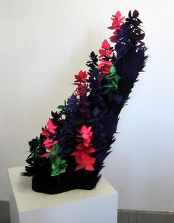
Diane Carr
"Forest Edge"
2006
Ink, paper, foam, resin
40 x 20 x 18 inches
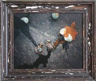
NURTUREart: "Another Place," the group show currently on view at Supreme Trading*, reminds me why my favorite moments with art almost always occur in the home or some similarly private setting. Most of the work included in the exhibition is strong - particularly pieces by Jimbo Blachly and Diane Carr - but presented in the gallery space, with its tall, white walls and heavy stone floor, much of the work is overwhelmed. With one or two exceptions, the sculptures, drawings and paintings in "Another Place" are intimate works and in such an airy setting they can be dismissed as precious.
The theme of the show, the "environment [explored] through the creation of imagined spaces," is timely. Many young artists are mining this vein. Thoughtful landscape art is a vehicle for contemplation and the best work in "Another Place" succeeds on this count, but these artists are interested in a subdued sense of the sublime, more meditative sojourn - the projected interior world - than awesome, violent vista - the reflected exterior world. This being the case, I feel that a sculpture like Carr's "Forest Edge" would be best served by exhibition in a living room. This isn't to say that the gallery space diminishes the aesthetic strength of the work - it doesn't - but that the quiet rumination the artwork desires (and deserves) is that much harder to achieve in this venue.
I don't intend to criticize the curators, NURTUREart or Supreme Trading. "Another Place" is a good exhibition. It just made me pine for the more places like the Morgan Library or Frick Collection.
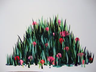
Diane Carr
"Field"
2006
Ink, paper
30 x 40 inches
* NURTUREart is in the process of moving to new digs on Bogart Street; Supreme Trading hosts the exhibition during the transition.
+++++
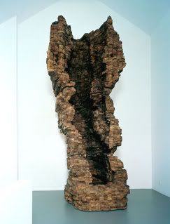
Ursula von Rydingsvard
"Wall Pocket"
2003-2004
Cedar, graphite
162 x 72 x 65 inches
Galerie Lelong: For a number of years now I've held Ursula von Rydingsvard's sculpture in reserved esteem. Her heavy-bodied, cedar constructions appealed to me and I recognized them as "good" art, but I was never excited or moved by the work. That changed a month ago, when I first visited "Damski Czepek," the centerpiece of a sculptural installation in Madison Square Park. Captivating, attractive and mysterious, "Damski Czepak" is cast in a translucent resin, allowing light to pass through the walls of the grotto-like sculpture and paint the piece in luminous blues, reds, and purples. On one of my strolls through the park, several children played on the long tendrils that extend from the grotto itself. They looked to the entrance, where a playmate stood staring up at the little cave's roof, grinning.
In her latest gallery show, "Sylwetka," von Rydingsvard continues to impress me. This is the sort of show you must visit when crowds are absent. The sculptures' size - most are quite large - and rough, heavily worked surfaces inspire viewers to engage them in a physical fashion. It takes resolve not to touch them, and I found myself inhaling deeply the cedar scent and considering the work from many vantage points, squatting at the base of one, circling another, and peering down into an opening on the head of a third.
Everything I have read about von Rydingsvard suggests that her sculptures are inspired by everyday, household objects. Spoons, forks, plates, and brushes, for example, or, in the case of "Damski Czepak," the resin work in Madison Square Park, a bonnet. Personally, I reject this reading, though I know it to be the artist's own. I have little interest in viewing "Damski Czepak" as a giant bonnet. For me it is a coastal cave, transplanted from the shores of the Aegean in a time, maybe even a dimension, not entirely our own. For the children playing on the tendrils it was something different, but no less wonderful.
My favorite works in "Sylwetka" also transcend their mundane inspirations. "Small Comb" and "Dubeltowa (Double)" reach toward the metaphysical. The artist Matthew Ritchie, a favorite of mine, comes to mind when I notice the marks and notes von Rydingsvard has left on the cut cedar surfaces. These marks map the mind's peregrinations; obscured by woodworking tools and partial erasures, then removed from the studio and presented out of context, the notes are traces of an abstruse plan that only the artist and her assistants might decipher. Even the exhibition's title, "Sylwetka," which means "silhouette" in Polish, nods to theoretical physics, with its limning of multiple dimensions and incomprehensible, immeasurable varieties of dark matter and dark energy.
Based on what little I know, I assume that the artist would find my reading of her recent work entirely foreign, but whatever her intent, "Sylwetka" and "Damski Czepak" erased all reservations. I now hold Ursula von Rydingsvard's sculpture in high esteem.
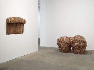
Ursula von Rydingsvard
Installation view of /Sylwetka/
Left: "Small Comb," 2004
Right: "Dubeltowa (Double)," 2006
Cedar, graphite
+++++
Esko Mannikko
"Rapakivi"
Date ?
Chromogenic Print, edition of 20
18 x 21 1/4 inches
Yancey Richardson: I enjoy looking at photographs a great deal. Just a few years back, my appreciation of the medium drew some derision, especially from my painter friends. These days, though, it seems even long-time naysayers are coming 'round. Unfortunately, I usually find photography exhibitions, even those featuring work by photographers I admire, a bit lifeless. This is less often the fault of the images than the presentation. I realize that a plain black or white floater frame is, perhaps, the best way to display and protect photographs (and other works on paper), but if all pictures in a room are prepared in this way, the sameness can distract and dull. I was delighted, therefore, by the installation of Esko Mannikko's "Cocktails," at Yancey Richardson.
The close quarters of Mannikko's interiors and the tight cropping of his animal pictures are complemented by the cluttered hanging. Crowded up against one another - literally, there is no space between the work - the photographs are displayed in old, found frames, another unusual choice that further flatters the already striking prints.
It doesn't hurt that Mannikko's subject matter is close to my heart, if not my homeland. The photographer's rural Finland supports a foreign flora and fauna, but the lifestyles of his subjects are little different from those of the folks I grew up with on a more rural Delmarva Peninsula. My own drawers and scrapbooks are piled high with images of hunters alongside field dressed game, animal jaw bones and decrepit island hunting shacks, and I responded immediately to Mannikko's stolen moments, glimpses of a complex, but intimate relationship between rural people and their animal neighbors. The artist writes, "My installation is like a village, composed of people, animals, buildings, still lives - all together."
Despite my appreciation of the medium, it is rare that I respond to a photograph as viscerally as I do an exceptional painting. Visiting "Cocktails," however, I was rewarded a few times over. Works like "Mandibula" and "Rapakivi" are stunners, and the exhibition as a whole is impressive. With the exception of a few works that seem undistinguished or too self-consciously composed, "Cocktails" is a singular showing.
Esko Mannikko
"Mandibula"
Date ?
Chromogenic Print, edition of 20
20 x 24 inches
+++++
Nicholas Di Genova
"Cuttlefish Floater"
2006
Ink and acrylic on mylar
24 x 30 inches
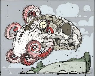
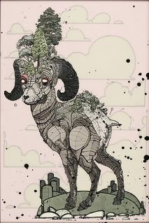
Fredericks & Freiser: In early 2005, when I first came across Nicholas Di Genova's layered mylar paintings, I was impressed. However, because I was so enamored of - even distracted by - the artist's accomplished graphic technique, my consideration of the work was superficial, of the gee-whiz-ain't-it-great variety.
Happily, I was able to spend more time with the paintings included in "Death From Below," the Canadian artist's current solo show at Fredericks & Freiser. I admired them long enough for the initial intoxication to wear off, allowing me to think about the work in terms other than "kick ass" or "f*ckin' tight."
The gallery's press release describes Di Genova's paintings as "fine-lined Darwinian allegories." I'm not sure this is applicable; I see little Darwin in Di Genova's mongrel machine-animals. His beasts are not products of natural selection but rather monsters borne of the violence, deceit, fear and uncertainty which permeate contemporary life. Hieronymous Bosch and Francisco Goya (the latter is also mentioned in the press release) are the more fitting ancestors, although I would argue that Di Genova's graphic line and composition align him even more closely with a group that, for most of the twentieth century, was unfairly maligned in the world of "fine art": the many popular artists who have long reflected and confronted grievous social truths in the pages of graphic novels or on facades of buildings.
The animal body parts that appear in his work are signs, not representations. In other words, the ox with a gun head is closely related to - even interchangeable with - the sunning anhinga with a gun head; what matters is the mess that has been made of the various components, not the animal species themselves. As long as the viewer recognizes the product as a grotesque, if seductively rendered hybrid - part natural, part manufactured - Di Genova has communicated his intent. In essence, the artist, like others who work with signs - notably, the popular influences mentioned above - traffics in visual shorthand; specificity is less important than style and statement.
The essential similarity of Di Genova's paintings, then, makes sense; the artist is riffing on a recipe with limited ingredients and Di Genova uses repetition and remixing to his advantage. In fact, the comparison that came to mind was the mix-and-match surgery so many of us - of a certain age - did with G.I. Joe action figures in the eighties. Because the construction of the figures allowed for it, you could easily disassemble the given characters and "make" a cast all your own. Back then I called it Frankensteining, and the fact that my time with Di Genova's paintings brought it to mind is fitting, given the monsters he depicts.
On the other hand, the similarity of the work serves another, almost contrary purpose. Because all the monsters featured in "Death From Below" are variations on a familiar theme - riffs on that one recipe - the viewer is encouraged to look closely at each piece and, in doing so, learn more about the given character of the "original" hybrid.
The press release suggests that very few artists since Goya have "attempted to tease...monsters out into the light of day." A great number of talented artists are being snubbed here. A trip to the west coast or, faster and cheaper for those of us on Atlantic shores, a few minutes spent on the websites of collectives such as ArtDorks or BLK/MRKT Gallery will just scratch the surface of this tribe. The times are changing quickly, however, and the Art World at large will see an increasing amount of graphic/graffiti influenced work appearing on white gallery walls and over couches of the monied and privileged. Generally, I feel this is a positive development - despite the sad commentary of graffiti/populist approaches stolen from the public for use as one more commodity/investment - but I hope a good number of these artists are able to avoid the common pitfalls of the genre.
In Di Genova's case, at least, the work is growing more sophisticated and complex while retaining the gee-whiz visual punch that so excited me back when I wrote that I was "ready to trade (or steal) to get one." I expect more good things will follow.
Nicholas Di Genova
"The Great Oasis Ram"
2006
Ink and acrylic on mylar
36 x 24 inches
+++++
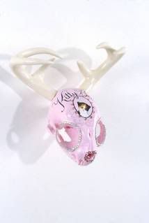
Alessandra Exposito
"Kitty Bean"
2005
Mixed media on cat skull
3 3/4 x 3 1/2 x 1 1/2 inches
Mixed Greens: Alessandra Exposito's second solo show at Mixed Greens is divided between the front and back gallery spaces; my opinion of the show is similarly split.
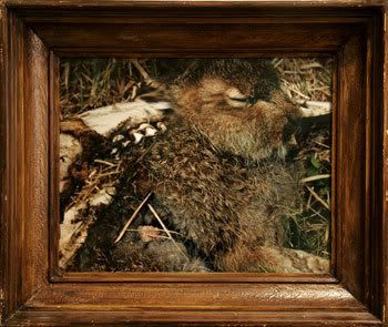
The walls of the front space are hung with decorated chicken, dog, cat, mouse and horse skulls. These skulls are painted in pastels and saturated primaries, and bedazzled with rhinestones. Central to each piece is a stylized depiction of the living animal, with its fictitious name emblazoned above. I'd be lying if I said I didn't get a kick out of these works. They're at once sweet, in a vaguely morbid way, and zany. By attaching proportioned antlers or horns* to all of these skulls, Exposito has turned them into surreal caricatures of death, a kind of pop sublime. They are the skeletal remains of a boy's demonic fantasy - I thought of Herne the Hunter, satyrs and Bosch's hybrid creations - rendered impotent by the imagination of a girl.
I assume this is just the sort of reaction the artist desires; all of her statements stress her interest in sexuality and culture. But, and I recognize that I'm being a bit particular here, I am troubled (just a bit) by all the invention. These skulls belong to once living creatures - real horses, chickens, cats, mice and dogs - and I felt as though the artifice of Exposito's project somehow cheated them a bit. Would we dig up the bones of a loved relative and cast it as someone else? Unlikely. I found myself wishing the "memorial portraits" were not fictitious, and that the skulls had been obtained from actual owners interested in celebrating the life of a beloved companion.
This is a very individual criticism, to be sure - regular readers will know just how animal obsessed I am - but it led me to another complaint, though one not inspired by the art so much as the artist's statements and the gallery's press release, which reads, "[Exposito] flirts with machismo stereotypes associated with the 'hunter'." I appreciate the rhetoric involved in the statement and certainly understand why Exposito would be drawn to the "trophy head" as a masculine symbol - not one, mind you, that most of us are proud of - but I always wince when I see "the hunter" reduced in this way. This stereotyping reeks of a common misunderstanding, whereby we confuse social/cultural evolution with a remove from blood letting, when those that so remove themselves - urban dwellers like me, for example - are almost always assigning their bloody obligations to another, less privileged member of the species. Furthermore, it undermines a richer reading, one that includes the species old dialogue with death, as understood through shamanism, ritual and myth. But this is not a failure of the work so much as a failure of the work's justification, just one more reason I feel the less said about one's work the better. Indeed, my ultimate index for judging a work of art is how much time I would like to spend with it, and I wanted to take "Buckshot," and one or two other "pets," home with me, to live with.
The paintings in the rear Mixed Greens gallery, however, left me cold despite their warm palettes. I spent long minutes with some of the skulls in front, but my circle through the back space took all of ten seconds. One could argue that I didn't give the work enough time, but I did, and then I returned to the front, to spend some more time with "Buckshot."
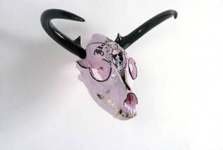
Alessandra Exposito
"Buckshot"
2006
Mixed media on dog skull
6 x 8 x 5 1/2 inches
* In an interview on the Mixed Greens website, the artist makes an all too common mistake, referring to deer antlers as horns. Click for today's natural history lesson.
+++++

Kay Rosen
"Yellowish, reddish"
2003
Color pencil on paper
18 x 25 inches
Yvon Lambert: Although the show is no more remarkable than any of Kay Rosen's efforts, I enjoyed most of the pieces included in "Wall Paintings and Drawings 2002-2006." Many artists find her work too straightforward, but the apparent simplicity of her presentation is essential to the works' communicative ability. The clean lines and striking color combinations compliment the etymological investigations that are Rosen's focus and assist the viewer in understanding language as a construction or puzzle to be diagrammed, dissected and reworked. For the polyglots among us - and those, like me, that stumble along with no ear for languages but nevertheless fancy themselves amateur philologists - Rosen's paintings and drawings are a treat. As I wrote here about a year ago, she "rocks in her own quiet, thoughtful way."
(The piece pictured above, "Yellowish, reddish," is included in the Yvon Lambert exhibition, but it isn't among my favorites. Unfortunately, I couldn't find any of these online and I ran out of time and so neglected to contact the gallery. If you swing by the show, be sure to check out "Semi-colonization.")
+++++
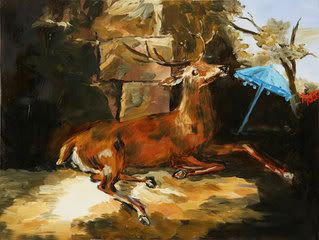
Karen Kilimnik
"the Malaysian deer in France"
2006
Water soluble oil color on canvas
9 x 12 inches
303 Gallery: Why do I like Karen Kilimnik's paintings? Seriously. This is an open question. I don't care for Elizabeth Peyton or any other artists that share Kilimnik's fast and loose aesthetic. Why, then, don't I find Kilimnik's work as irrelevant and vapid as the rest?
The exhibition currently on display at 303 doesn't offer an answer. Only two of the included paintings (pictured here) are strong - and most are relatively weak - but I still left the space with a smile and the sense that Kilimnik is a cut above most contemporary painters. What's this about? Is her subject matter, seemingly so open ended, able to satisfy all my varied appetites? Hell if I can figure it out... Whatever. I'll stick to my guns. Karen Kilimnik is a good painter.
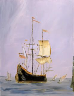
Karen Kilimnik
"arriving at the cove, Hawaii, 1600s"
2005
Water soluble oil color on canvas
11 x 14 inches
+++++
Photo credits: Diane Carr images courtesy the artist; Ursula von Rydingsvard images ripped from Galerie Lelong; Esko Manniko images ripped from Yancey Richardson Gallery; Alessandra Exposito image ripped from Mixed Greens; Nicholas Di Genova images courtesy Fredericks & Freiser Gallery; Kay Rosen image ripped from artnet.com; Karen Kilimnik images ripped from 303 Gallery
2 comments:
In talking about 'Another Place' you use the phrase "...can be dismissed as precious." I know that you where referring to the exhibit space in relation to the work, but it struck me and made me wonder. Why is preciousness grounds for dismissal? I have heard that detractor again and again, but when I consider it, I can find no real reason that it should be held in such contempt. It has plenty of applications in art school, where professors attempt to tease students out of their shells, but why has this concept escaped and proliferated? It seems doubly confusing when one considers the popularity if folk/outsider artists. What could be more precious? It seems to me that we, a society of squandered resources and disposible schlock, could do with a little MORE preciousness in our lives.
Michael,
Yeah, you raise a good point.
In this case, however, I was thinking of "precious" not so much in the folksy/outsider sense of the word, which I guess could be compared to "naive" or "honest," but rather in a lifeless, decorative sort of way...a worldview in which the blood-and-guts are ignored (or denied) in favor of so many colorful rainbows and My Little Ponies.
The space didn't, in fact, render the work "precious," but it did serve as a detriment.
Post a Comment