Showing posts with label illustration. Show all posts

Thursday, August 13, 2009

Lowbrow Meets Highbrow


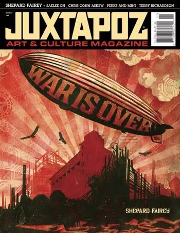
Issue of Juxtapoz Magazine
Cover art by Shepard Fairy
"A frog is either lowbrow or highbrow.

If you catch it, it's low. If you order it in a French restaurant, it's high."

-Unidentified chef, from Burkhard Bilger's Noodling for Flatheads
In 2007, commenting on the blog PaintersNYC, artist Kelli Williams observed that it's hard to be a Juxtapoz artist "in an ArtForum world." Juxtapoz is a popular magazine dedicated to showcasing contemporary "lowbrow art." It was founded by the artist Robert Williams in 1994. The "ArtForum world" of Kelli William's statement references the magazine of that name, but also the "high art" scene it covers, of which New York City, for the time being, remains an - if not the - epicenter. Until recently, the artwork featured in ArtForum was very different from that seen in the pages of Juxtapoz. Juxtapoz is representative of the Los Angeles art scene, and the U.S. west coast scene more generally, where the aesthetics of pop surrealism, folk art, post-graffiti, or street art are wholly embraced.

But artwork infused by Juxtapoz's colorful spirit is no longer uncommon in New York galleries. Andrew Schoultz, Tim Biskup, and Jeff Soto, talented west coast artists regularly lauded in the pages of Juxtapoz, today exhibit with the Morgan Lehman and Jonathan Levine galleries, and influential post-graffiti artist Barry "Twist" McGee is represented by the renowned Deitch Projects. Jonathan Levine makes plain his dedication to the post-graffiti aesthetic; his gallery's website states that its mission is to exhibit "work influenced by illustration, comic books, graffiti art and pop imagery." Perhaps it's no longer so hard, then, to be a Juxtapoz artist "in an ArtForum world"?

But, more importantly, does lowbrow art require the affirmation of the "high art" world - for easy contrast, let's call it highbrow art - in order to be considered mainstream or legitimate? If so, what exactly is the cultural significance of highbrow art to the world at large?
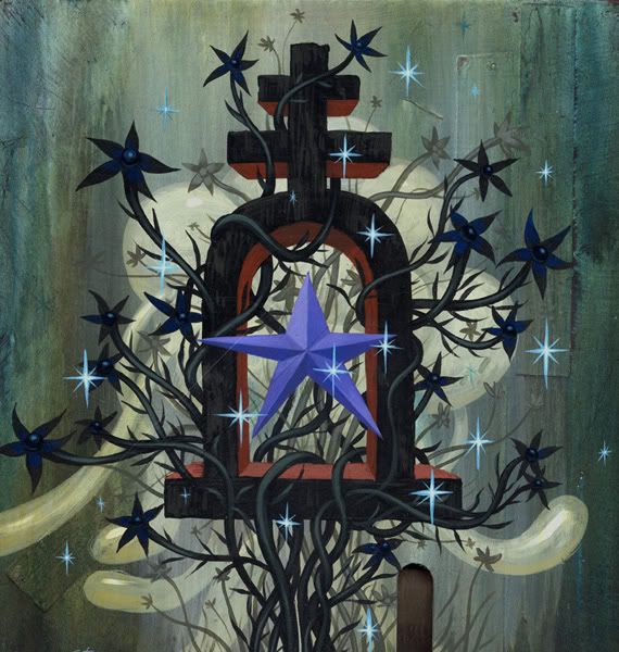

Jeff Soto
"Purple Heart"
2007
Acrylic on wood
12 x 12 inches

The commercial success of books like Beautiful Losers: Contemporary Art and Street Culture and Wall and Piece, the latest offering from the infamous British artist, Banksy, suggest that pop surrealism, post-graffiti, and street art succeed in connecting with the multitudes. On the other hand, it's an uncontroversial fact that highbrow art generally doesn't move the masses (with the exception of its remarkable ability to offend the religious sensibilities of the Christian Right and certain mayors). But highbrow art doesn't simply fail to connect with the general population; the fact is, most folks sneer at, mistrust, or resent ArtForum's world.

Perhaps because they feel beleaguered by popular tastes, many players in the world of highbrow art - artists, gallerists, critics, and curators alike - reject the influx of pop surrealism and post-graffiti flavor. But their objections will inevitably prove inconsequential; as the Borg of "Star Trek" put it, "resistance is futile." Even if some of the more esoteric subcultures of the Juxtapoz arena - Tiki culture, for example - are unlikely to find a toehold in the world of "high art," the graphic influences common to post-graffiti work already inform the paintings of contemporary art world darlings like Dana Schutz, Marcel Dzama, Trenton Doyle Hancock, Ryan McGuinness, Lisa Yuskavage, Yoshitomo Nara, and Jules de Balincourt. (In fact, Dzama and McGuinness have been featured in Juxtapoz; it won't be long before other celebrated highbrow artists are, too. One wonders if the lowbrow label will be applicable for much longer.) And then there are artists like Judith Schaechter, whose stained glass works were lauded in the pages of Juxtapoz years before her work hung in the Whitney Museum or before she received Guggenheim and National Endowment for the Arts Fellowships.
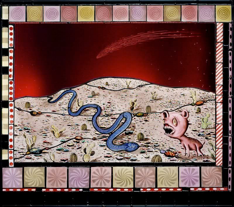

Judith Schaechter
"Hyena Snake Comet"
2004-2008
Stained glass
30 x 33 inches

Much of the highbrow resistance to pop surrealism and post-graffiti is rooted in the self-identified elites' distrust of populism. Comic books and strips are intended for mass consumption, but graffiti is unquestionably the most populist of the lowbrow tributaries. No art form has fewer barriers to entry; all you need is a can of spray paint and a little chutzpah. Ask someone knowledgeable about the subject to relate the history of modern graffiti, and you'll likely hear an abridged version, one that begins in the 1970s, in and around New York City's Bronx River Houses, and runs parallel to the development of hip hop. City funding for arts and culture programs was pitifully low at the time, and enterprising teens looked for new ways to entertain and express themselves. As Lady Pink, an influential graffiti artist of the late 1970s and 1980s, explains, graffiti was the most available "forum for free speech."

Of course, the human urge to make marks predates the Bronx River Houses by millennia. Our ancestors depicted their quarry on cave walls and, more recently, citizens of ancient Rome scribbled their political opinions on market stalls (hence the word's etymology, from the Italian graffiare, meaning "to scratch or scribble.") But during the early days of modern graffiti's ascendancy, practitioners prioritized ego over observation or socio-political commentary. The pioneers of the 1970s and 1980s graffiti scenes in New York City and Philadelphia - Taki 183, StayHigh 149, Cat 161, and Cornbread, among others - were primarily known for their "tags," stylized monikers spray painted on walls and subway cars. They vied for renown by tagging as many surfaces as they could, and walls that were difficult to access had a special cache. The competitive behavior of these early graffiti "artists" might be best described as base scent marking, activity essentially indistinguishable from the industry of the bored high school student who scratches "(x) was here" on the wall of the bathroom stall. Fortunately, as more artists entered the nascent graffiti scene, such adolescent "battling" became insufficient impetus; soon, the egotistical tag evolved into something more colorful and complex. Artists added characters, often comic in nature, a result of their limited palettes and time frame, and, before long, these characters evolved into "pieces" (short for masterpieces). The best graffiti artists came to value style and artistry as much as placement.

The conceptual and social strengths of graffiti and street art are rooted in the artists' acceptance of temporality and his or her desire to engage the environment and citizenry directly. As Simon Hattenstone, a features writer for The Manchester Guardian, writes, "Since spotting my first few Banksies I have been desperately seeking out more. They make me smile and feel optimistic about the possibilities of shared dreams and common ownership." Insofar as it is truly democratic, the street artist's approach is fundamentally distinct from that of those who aspire to "high art" success. "Fine artists" are essentially aristocratic in inclination. They are the elites who operate within the context of "high art" institutions; their work is most often viewed in semi-sacred, unlived in spaces, by people who talk about the work in reverent whispers. Street art, by contrast, is viewed by everybody who happens past the artwork. But, today, as the post-graffiti movement sees many of its more celebrated artists entering the "high art" sphere, the populist flavoring of the culture is eroding.


Banksy
"Balloongirl"
Artwork on West Bank barrier between Israel and the West Bank
2005

Is the aesthetic melting pot a bad thing? The answer depends on your perspective, of course; personally, I'm all for it. Like many contemporary artists, I'm not alone in feeling that my artwork and aesthetic inclinations plant a standard somewhere between the poles of Juxtapoz and ArtForum. Just as I feel torn between my rural roots and the creative community and energy of city life, so too am I drawn to elements of both art orbits, east and west, highbrow and lowbrow. I live and work in New York, so I've cultivated an appreciation for the importance of conceptual heft. But I'm also an erstwhile subscriber to Juxtapoz who, in my youth, eagerly thumbed through the pages of the Advanced Dungeons & Dragons Monster Manual, read fantasy novels and comic books, and honed my drawing chops by copying from comic strips. Perhaps I'm biased, then, but it seems that aesthetic commingling introduces hybrid vigor into otherwise "inbred" scenes.

Too many circles of the "high art" world are poisoned by intellectual pretension, obscurantism, and exclusivity. The ArtForum world is principally concerned with auction results and art historical significance. In east coast MFA programs, the mills of the contemporary "high art" world, a common question asked of students is, "Where does your work fit in the historical trajectory?" Indeed, at great cost to social legitimacy, the "high art" world has prioritized originality and artistic genealogy.

Much of the "lowbrow" scene, by contrast, is blighted by the artists' focus on disposable pop culture, their willingness to cozy up to the marketing machine, and their populist posturing. In an interview with Juxtapoz, one young artist said,
"When it comes right down to it, I draw the stuff I like, and people can take it all for whatever they want. I would say that 95 percent is liking big boobs and butts, the other five percent is brain farts that end up in a sketchbook that later ends up as a painting or whatever."
Although I wrote down this quotation without recording the artist's name, I do recall appreciating some of his graphic skill. Still, when I'm confronted with such a thoughtless statement, I can appreciate the animus that brooding, theory-oriented types have for lowbrow art. Where is the evidence of this young artist's vocational mindfulness, his rigorous passion, his poetic sensibility? Of course, his defenders would likely praise his candor, but, in truth, he's posturing as much as the bespectacled, black-clad fellow who insists in his jargon-laden artist statement that Jacques Derrida informs all of his output.
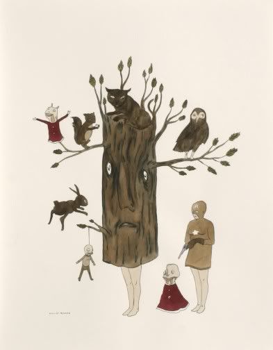

Marcel Dzama
"Untitled"
2005
Watercolor on paper
14 x 11 inches

Despite haughty sneers from individuals on both sides, it seems to me that the transition that so many post-graffiti artists are making, from the streets to the galleries, could (and should) help create a less sectarian art world. The selfish pretensions of the highbrow art world could be tempered by an influx of no-nonsense, illustrative exuberance, and the lowbrow art world could jettison some of their conceptual superficiality by taking the philosophical and moral obligations of their vocation more seriously. That is, in any case, my hope.

Image credits: Juxtapoz cover image ripped from Rotofugi.com;; Jeff Soto image ripped from the Jonathan Levine Gallery website; Judith Schaechter image ripped from the artist's website; Banksy image ripped from the Brian Sewell Art Directory; Marcel Dzama image ripped from David Zwirner website

Saturday, June 30, 2007

Gallery Report: June 27, 2007

Part One
This Gallery Report will be posted in several parts, appearing separately over the next couple of weeks.

The first installment, below, deals with four shows that, for one reason or another (or one artist or another), I liked. The forthcoming posts will discuss a group show at RARE, a tribal art exhibition at Betty Cuningham, and Michael Light's exceptional aerial photographs and bookworks on display at Hosfelt Gallery.

Note: In the interest of full disclosure, I went to graduate school with two of the artists highlighted here. I've been able to see the work of Amy Talluto and Doug Morris develop over the last five or six years, but I don't believe I allow these personal associations to bias my opinion of their work, dubious though the claim may seem.

+ + + + +


David Kennedy-Cutler
"Dying of Not Dying"
2005
Bubble gum, tree branch, wood
42 x 19 x 9 inches

Morgan Lehman Gallery: This being summertime, New York's galleries are predominantly occupied by half-baked group shows, and so "Promised Land," curated by Elizabeth M. Grady of the Whitney Museum, stood out on paper. The exhibition "[addresses] the recent upsurge in art dealing with 'American' imagery" and "the invention of a national identity." This should be exciting, complex stuff!


Kimi Weart
"untitled"
2006
Graphite and neon paint on paper
51 1/2 x 89 inches

The strongest pieces in the show are the most iconoclastic, even though their critique is also the most general. Perhaps they work because the artists' broad stroke approach allows the viewer some wiggle room? If artists offer too pointed an allegory or critique, the work becomes almost pedantic. Indeed, the more "clever" works in "Promised Land" suffer for this very reason. Instead, it is the artworks that take advantage of more obvious imagery -- those that, were I to have them described to me before having seen the show, would sound almost trite -- that are the most successful. In this group I would include pieces by Kimi Weart, Aaron Morse, and David Kennedy-Cutler.

+ + + + +


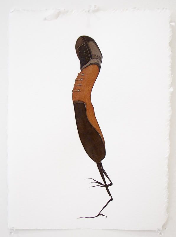
Marcia Kure
"012"
2006
Kolanut pigment, watercolor, pencil on paper
15 x 11 inches

BravinLee programs: Aptly called the "Vogue Series," Marcia Kure's works on paper are as chic as they are charming. Frankly, it's a bit surprising to see these whimsical, freely handled kolanut pigment, watercolor, and pencil drawings in Chelsea. They aren't a far cry from some steampunk costume design, the sort of thing you might find under the Extras menu on a DVD. Kure presents us with space cowboys, Victorian walrus men, and robed birds vaguely reminiscent of Henson's Skeksis. Personally, I love it, but a slew of my arty friends, the same bunch that uses "illustration" as a four-letter word, would shrug the show off. It's their loss.


Marcia Kure
"0.5 Tons II"
2006
Kolanut pigment, watercolor, pencil on paper
15 x 11 inches

My favorite drawings on display - there were at least forty works included - were Kure's most original creations, or at least those most unfamiliar to me. "0.5 Tons II" pictures a brainy she-male, and could be interpreted as an allegory of the tortured artist as Tiresias, and "012" seems to be the product of a menage a trois involving Marvin the Martian, a long-legged sparrow, and a hot dog. When I visit a show like Kure's, I pity those art viewers who are unable to appreciate whimsy; these small works are a joy to look at.

+ + + + +


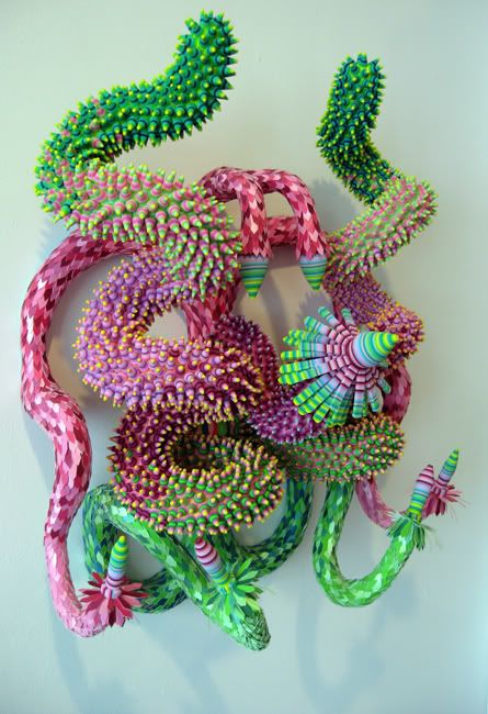
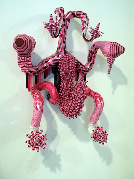
Doug Morris
"untitled"
2002
Ribbon, foam, paper
approx. 24 x 30 x 18 inches

David Krut Projects: I very much like Renee Ricardo's curatorial impetus for HOMEGROWN. "18 emerging artists and art collectives from Boston, Los Angeles, Miami, New York, and Seattle" are included, all of whom "[take] cues from such homegrown practices as collage, quilting, crochet, embroidery, cross-stitch, and assemblage." Unfortunately much of the work on hand seems gestative yet, as though these artists might wow me five years out. But Margaret Lee, Jon Rosenbaum, Anne-Francoise Potterat, Doug Morris, and Erika Somogyi are exceptions and, of this group, Morris's work is the strongest.


Doug Morris
"untitled"
2006
Ribbon, foam, paper
approx. 18 x 16 x 8 inches

The gallery press release states that Morris "[pulls] imagery from many sources - ranging from Mexican folk art to a vacuum cover made by his grandmother." To my eye these brightly colored, impish creations are as closely related to molecular structure diagrams, Bosch's demons, and Hentai as they are pinatas. But whatever Morris's sources, the sculptures are playfully lewd and aesthetically seductive.

+ + + + +


Amy Talluto
"Burn 2"
2006
Pencil on paper
11 x 14 inches

Black & White: On the whole "En Plein Air RELOADED," a promising group show at Black & White Gallery's Chelsea location, falls flat, the result of concept trumping execution. Each of these artists is invested in their work, but as a viewer I struggle to establish the sort of connection I have come to expect from successful investigations of landscape.


Amy Talluto
"Blue"
2006
Oil on canvas
48 x 36 inches

The best landscape art, broad and ambiguous though the classification may be, shows more than it tells, granting the viewer an opportunity to experience land anew or in a heightened state - as in works by Caspar David Friedrich, Thomas Cole, or Robert Smithson - or offering us glimpses of worlds we may not know or haven't had a chance to contemplate - an Edward Burtynsky photograph, for example. Most of the work included in "En Plein Air" "subverts the traditional genre of landscape," as the press release puts it, by foregrounding the sub-text. The experiential aspect of these landscapes is largely erased in the process (or made artificially alien and off-putting in the case of Fiona Gardner's ultra-sharp photographs of Southern belles in a Florida theme park).


Amy Talluto
"Burn 3"
2007
Pencil on paper
10 x 13 inches

Amy Talluto's inclusions are an exception. Regular readers know that I very much like Talluto's paintings - even Art Fag City referenced my affection for her work - but I didn't realize just how accomplished Talluto's drawing has become. As far as I'm concerned, "Burn 2," "Burn 3," and "Blue" stole the show. I'm eager to see Amy's next solo outing, whenever it may come.

+ + + + +

Photo credits: David Kennedy-Cutler and Kimi Weart images ripped from Morgan Lehman webiste; Marcia Kure images courtesy BravinLee; Doug Morris images taken by Hungry Hyaena; Amy Talluto images courtesy artist

Thursday, May 31, 2007

Old Mud Blood at the Banshee

"And I do not want anymore to be useful, to be docile, to lead
children out of the fields into the text
of civility, to teach them that they are (they are not) better
than the grass."

-Mary Oliver, excerpt from Rain, originally published in "New Poems"(1991 - 1992)
A year or so ago I met a friend for drinks at The Banshee on Manhattan's Upper East Side. Sitting next to us at the bar was a poet, in his early fifties, who had recently moved to New York from Los Angeles. Feeling uncharacteristically social (after sufficient lubrication), I got into a conversation with the man. He had experienced some critical success within west coast poetry circles but had grown frustrated with "the scene," and opted to try on NYC for size.

After a half-hour of talking, he announced, "Well this is really great. You're the first person I've met since moving that's really got me feeling like there is that creative pulse you always hear about New York." He insisted on giving me his card and asked for information on my website and future exhibitions. I've lived in New York long enough to view his gushing with some skepticism; still, I'd enjoyed the chat and exchanged information with him agreeably enough.

As the gentleman prepared to depart, he paused, cocked his head quizzically, and asked, "So who are your favorite contemporary poets?"

It was an easy question to answer. "At the moment I'm enjoying collections by Mary Oliver and Galway Kinnell. I've always..."

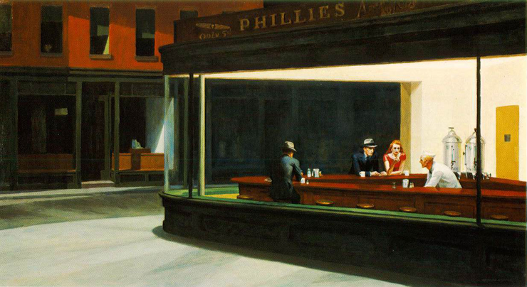
I couldn't finish my reply; the poet broke into a peal of laughter. I was understandably taken aback by this reaction. After regaining some semblance of self-control, he exclaimed, "And the whole time you had me thinking you knew good poetry from bad poetry. Mary Oliver is garbage. Kinnell is little better." I stared at him blankly. He laughed a little more, shook his head, and continued, "I mean, that's like me telling you that my favorite painters are Edward Hopper and Norman Rockwell. You'd be appalled. That's not even art! That's illustration!"

I wasn't quite sure what to say. I shrugged and finally said, "Well, I read a fair amount of poetry, so my landing on those two isn't just chance. I think they're good."

He appeared genuinely crestfallen. It was as though my bad taste sapped New York of the intellectual and creative energy he believed he had just become acquainted with. He may have pegged me for an appreciator of mundane poetry (guilty as charged, I suppose), but his explosive dismissal of Oliver and Kinnell, both gifted and rewarding poets, and his use of Hopper and Rockwell as parallels reveals inherited (or adopted) prejudice.

Hopper and Rockwell painted with reproduction in mind and, indeed, both worked as professional illustrators for a time; this being the case, labelling them illustrators isn't entirely inaccurate but, as Peter Schjeldahl wrote recently, "If 'Nighthawks' is an illustration, a kick in the head is a lullaby." Hopper and Rockwell aren't favorite artists of mine, but their work is not deserving of the lambasting it receives from so many art world experts. (The unintentionally comical Thomas Hoving, former director of the Metropolitan Museum of Art, comes to mind here. In the documentary, "Who The $#%& Jackson Pollock?," Hoving dismisses the opinion of someone outside the art establishment by wagging a finger and saying, “She knows nothing. I’m an expert. She’s not.”)

The truth is, many critics and connoisseurs build upon the existing scaffold of criticism and connoisseurship to such a degree that, generations down the line, their tower of opinions is an esoteric curiosity, shaky and too tall to be buttressed by the masses. I'm not suggesting that experts don't have a place nor that populist art is superior to "high" art, but merely that it is unfortunate that so many members of creative communities are eager to demonstrate their "expert" status by espousing those ideals or ideas most removed from the general consensus.

I sometimes struggle to explain Mary Oliver's value to non-believers. One acquaintance described Oliver as "the Thomas Kinkade of poetry." The comparison is ludicrous. Oliver writes of the "live animal," of a becoming with the natural world that impregnates experience with a meaning distinct from reason. Kinkade is the master of commodifying kitsch. They are worlds apart.

At any rate, I was all too happy to read Bioephemera's recent toast to Oliver. Cicada observes, "Some critics grumble that [Oliver] is insufficiently challenging or unsurprising, but she leans so heavily on the sense of wondrous recognition fed by nature, I wonder if a failure to be moved isn’t primarily a failure of that wonder-sense." Or, in the words of Oliver herself,
"I don't want you just to sit down at the table.
I don't want you just to eat, and be content.
I want you to walk out into the fields
where the water is shining, and the rice has risen.
I want you to stand there, far from the white tablecloth.
I want you to fill your hands with the mud, like a blessing."
-from Rice, "New Poems" (1991 - 1992)
Later in her post, Cicada describes the sense of belonging, if you will, that an Oliver poem provides. "...her poems make me feel rooted in humanity, grounded in my own body, aware of this lumpy, piecemeal tangle of cells which is somehow, miraculously, taking pleasure in language. Oliver’s poems are spiritual experiences for those who would not necessarily describe themselves as spiritual." But why take her word for it?

The Fish
The first fish
I ever caught
would not lie down
quiet in the pail
but flailed and sucked
at the burning
amazement of the air
and died
in the slow pouring off
of rainbows. Later
I opened his body and separated
the flesh from the bones
and ate him. Now the sea
is in me: I am the fish, the fish
glitters in me; we are
risen, tangled together, certain to fall
back to the sea. Out of pain,
and pain, and more pain
we feed this feverish plot, we are nourished
by the mystery.
-from "American Primitive" (1983)


I guess it's true that one man's "garbage" is....

Photo credit: Hungry Hyaena, 2002

Saturday, March 17, 2007

More Spam Fun

Check out the two animated shorts below. A friend of mine drew my attention to these videos after reading the previous post. They're terrific, and certainly worth sharing.


+++++

Thursday, August 04, 2005

Peter Schjeldahl on Winslow Homer

Image hosted by Photobucket.com
Winslow Homer
"Right and left"
Oil on canvas
1909

Peter Schjeldahl is one of the most respected American art critics. He served for years as the Village Voice's chief critic, but when The New Yorker hired him in the nineties, his readership expanded and he won much acclaim.

Schjeldahl's criticism is curious, often barely qualifying as such; he tends to write free-form essays about artists and exhibitions that he appreciates, saving invective for misguided art world fads. When a writer is as intelligent and creative as Schjeldahl is, this approach often results in a generous, beautiful essay.

Schjeldahl's latest New Yorker offering, "Telling Stories," is a review of the Winslow Homer exhibition at the National Gallery in Washington, D.C. Whereas most critics would discuss a few paintings, focusing on formal elements and the art historical significance of the work, Schjeldahl instead analyzes the difference between "reportage and art" and confronts his bias against Homer.

At one point in "Telling Stories," Schjeldahl suggests that the recent surge of collector and curatorial interest in Winslow Homer is revealing.
"Homer's storytelling put him on the losing side of modern art. Alfred Stieglitz denigrated his work, though with an odd note of respect, as 'nothing more than the highest type of Illustration.'...Homer is improving at present because the banishment of illustration from canonical modern painting, after Manet, has worn out. We like stories, and important painting of the past forty years, from Gerhard Richter to John Currin, has become ever more illustrative, and enamored of the one-off image."
Well, to that, this proud one-offer can only say, "Amen."

Photo credit: "Left and Right," oil painting by Winslow Homer

Wednesday, August 03, 2005

Art World Ennui


My parents claim that I was wearing Winnie-the-Pooh pajamas when I first declared my artistic ambition. Asked by some house guests what I planned to be when I grew up, I supposedly replied, "Either a fireman or a cartoonist." Because memories easily merge with myth (especially when your father is a writer), I'm reasonably sure that this anecdote is apocryphal. Nevertheless, it reflects a truth; early on, I was determined to make pictures for a living.

I was twelve years-old when I created my first published strip. "Porky's Paradise," an adolescent homage to Berkeley Breathed's "Bloom County," was printed weekly in the Eastern Shore News. Six years later, my last strip, "Hangin' In There," appeared regularly in the William & Mary Flat Hat. This college humor strip detailed the mundane anxieties of a long-haired undergraduate with a penchant for combat boots and flannel.

Although "Hangin' In There" was created during my freshman year of college, my career goals had by then shifted. I'd become more interested in comic books and graphic novels, and I was most excited by "The Mole" and "Raccoon-Man," comic book series that I'd begun working on in my senior year of high school. Although only my close friends read these comics (offering lukewarm reactions), I was nonetheless convinced that I was destined for a lucrative career with Marvel, D.C. or Image. At William & Mary, I helped T Campbell, later the creator of "Fans" and a major success in the world of web comics, found and edit Unstrung Fiction, the college's first publication dedicated to the graphic novel.

Focused on sequential story-telling, it wasn't until my junior year of college that my priorities shifted again. I decided to become a painter. In retrospect, I think this decision sprung from my preference for illustrating "moments" rather than weaving narratives.

One can not suddenly abandon their influences, however, and I had a hard time with the exclusionary attitudes of "fine artists." My early moves into this hallowed domain were crude exercises, essential cartoons in oil paint. When asked by art instructors to name my artistic influences, I'd name Bill Watterson, Berkeley Breathed, and Todd McFarlane, while my classmates recited unfamiliar, European names.

Gradually, though, as I learned more about the work of twentieth century art world luminaries, I came to love the paintings of Egon Schiele, Max Beckmann and Francis Bacon. My attraction to these three artists should have come as no surprise, but it would be several years before I realized what these three painters share: a bold, graphic approach to contour and color. They are illustrators' painters every bit as much as they are painters' painters; their work points to the absurdity of the distinction.

My embrace of the graphic approach would raise the ire of my art professors. "Illustrator" was then, and to some extent remains, a four letter word in the art world. Once I was ensconced in the New York scene, the prejudice against "illustrative" works was even more apparent. If you weren't making installations, videos, sculpture or conceptual work, you were fighting uphill to find an audience. The intellectual insecurity that fed this unfortunate bias was largely a holdover from the confused nineties and an influx of young artists raised on comics and animation would soon breathe some vitality back into the increasingly insular art world.

I was perfectly positioned to take advantage of this sea change. I guess I did, too, for a hot second. As I explained in "Of Fairy Tales and Flights of Fancy," though, I tired of painting colorful, imagined wonderlands; it didn't feel wholly comfortable and, more importantly, it felt a little thoughtless or arbitrary. My current body of work is very satisfying, but I again find myself out of sync with art world preferences.

Art Forum, one of the better art magazines available, is usually a pleasure to flip through. Despite my loathing of most contemporary art writing, I even enjoy some of the articles and reviews published in its pages. The principal appeal of Art Forum, though, lies in its dimensions and heft; it presents the "reader" with lots of big pictures. The magazine is to artists what Cosmo might be to a teenage fashion queen, a collection of images you can hate, love or be decidedly ambivalent about. Also like Cosmo, Art Forum is comprised mainly of advertisements, though all of these are for galleries or shows. I dog-ear many pages in each issue and later look up the gallery or artist(s) online.

Lately, however, I've been marking only a few pages. My time spent with the magazine is no longer satisfying and, as I flip through each issue, I find myself wondering what the point is. Most of the artwork is irrelevant alongside the "real" issues of the day. Obviously, artistic likes and dislikes are subjective, but what I deal with now is best described as art world ennui. Such a position might be more understandable if I were a hugely successful, late career artist, an individual tired of the superficial art market, but I'm what they call an "emerging" artist, the equivalent of a Triple-A ball player waiting for his chance to get called to the big show, yet I already find much of the art world intensely boring, frivolous and irrelevant. If I wasn't so happy with my own work and, more importantly, so convinced that there is an awful lot of excellent work being produced by countless others, I would call this feeling an artistic crisis.

Fortunately, it is nothing of the sort. It is simply the realization that, while I do want to make a living from my artwork and therefore need to connect myself to this world, I will probably always remain at the fringes. This will surely make my career a less remarkable one, but I hope it keeps me more sane and gives me the leeway to flee New York and live in a community where I feel I can play a vital role, contributing to local conservation projects and involving myself in local governance/leadership.